Alternate Angles
Sutro, I see you…

Quick, can anyone guess where I took this?
And Bernal, so tiny. But from where?

And what could this be? Bertro? Surnal?

Also note Bernal’s new tower-identity-branding:

Cute, but you’re no Sutro.
The Bernal Heights microwave switch was once a major junction for San Francisco’s telecommunication network — read more on the AT&T “long lines” microwave network at your leisure. (Sadly it does not cover how microwaves were responsible for the GIANT DOG in the picture above.)

Hey, look, a link between Bernal and Mt. Diablo!

(Hope your house wasn’t in Glen Park or on Diamond Heights in the 60s…)
The cold war-hardened network was rather impressive and ran from the 50s to the 90s, but was done in by the massive bandwidth advantage of fiber optics developed in the 70s.

Some of the stations were crazy remote though — the relay station on Mt. Rose (on the Nevada side of the Sierras) was at 10,000 feet and had a gondola for access in winter.
Now if only AT&T SBC would put forth the same effort to get me a reliable signal on my iPhone. The “cold war” AT&T would not be amused.
Damn, Tourists!
Eric “The Incredimazing” Fischer used advanced geo-logic to filter tourists from locals in his Geotagger’s World Atlas.

Some people interpreted the Geotaggers’ World Atlas maps to be maps of tourism. This set is an attempt to figure out if that is really true. Some cities (for example Las Vegas and Venice) do seem to be photographed almost entirely by tourists. Others seem to have many pictures taken in places that tourists don’t visit.
Blue points on the map are pictures taken by locals (people who have taken pictures in this city dated over a range of a month or more).
Red points are pictures taken by tourists (people who seem to be a local of a different city and who took pictures in this city for less than a month).
Yellow points are pictures where it can’t be determined whether or not the photographer was a tourist (because they haven’t taken pictures anywhere for over a month). They are probably tourists but might just not post many pictures at all.
The maps are ordered by the number of pictures taken by locals.
Full set on Flickr, a few interesting ones below (click image to zoom)
NYC:

London:

Vancouver:

LA:

Rome:

Vegas:

Venice:

Detail of San Francisco:

Tourists are rare in the Mission, but they do seem to prefer the Castro, the southwest corner of Dolores Park and the murals on Balmy Alley.

BART Signage FAIL = Society FAIL?
Jeff at Spots Unknown points us to another example of a big thing just not giving a damn:
A few weeks back they painted the Powell/Montgomery/Embarcadero BART stations. Great, right? Well, in the process, they changed the signs. Not that they were so great to begin with, but the ones they replaced them with had me convinced that these were temporary ones until they were able to hang some fantastic new signs that would match the new paint scheme.
I can be naive.

I’ve seen this happen multiple times now – since these signs are posted at a height that is below the height of a BART train, when there’s a train in the platform, the signs are completely obscured…
This is easy enough to fix though:

Is apathy the real issue?
Stuff like this makes me sad. It makes me sad because sometimes I like to entertain the notion that San Francisco is a special place where the people who live here and the people in charge of stuff actually give a damn, that they’re proud. This blog is based on that innocent premise. But other times, I’m reminded that, to a large degree, it’s just not the case, that we are one big earthquake away from Louisiana status.
The frequency of transit fails on both BART and Muni are worrisome — do they point to a lack of investment and preventative maintenance? Is this what the Romans were thinking in the 3rd century? “Hey, the Via Appia used to be great, but it’s total crap these days.”
It’s not like we’re asking for mosaics made of Murano glass. (Actually, that would be very cool. I want stylish and highly visible rows of repeating signs made of Murano glass tiles please, distinct for each station. Thanks BART!)
Between civic apathy, an unwillingness to pay taxes for infrastructure, and government budget shortfalls, if there were a another 1906 level earthquake I have to wonder if San Francisco would end up like Detroit.
And don’t get me started on our creaking water and sewer infrastructure. If that goes, we’re historical footnotes.
Ghost in the Shell
More data made into maps:
Rhonda Friberg kindly points out Tim Sinnot‘s SF adaptation of Andy Woodruff’s paint-by-numbers idea — “displaying all addresses in a city by number, color ramped”:

The canals are very obvious. And as Tim notes, the gaps speak volumes.
Market, Mission and 3rd are probably the best examples of linear address scaling. Everything else is a crapshoot by neighborhood.
(Reading the Swordpress and Cartogrammer I realize what an utter map hack I am — apparently you can use computers to AUTOMATICALLY make maps. Astonishing.)
Speaking of others with mastery of both zeros and ones, Eric Fischer has computed yet another map out of SF Muni data. This one is a month’s worth of data:
Average speed at each location according to NextBus, April 13 – May 21, 2010.
Black is stopped (less than 3 mph). Red is slow (3-5 mph). Blue is normal operating speed (5-9 mph). Yellow is fast service (9-19 mph). Green is rapid movement (faster than 19 mph).

The Mission:

(Hint: take the 12 or the 27 instead of the 14.)
Here’s the same data in greyscale:
Average speed at each location according to NextBus, April 13 – May 21, 2010.
Each level of gray represents a speed increment of 0.1 mph, up to a threshold of 24 mph.

Downtown to 280/101.

It looks like a charcoal sketch by Da Vinci or Michaelangelo.
Ciudad de México Has Been Sinking (Not Me)
Hey, look, Mexico City!

Oooh, pretty colors! What could they mean? Foilage? Population density? Availability of huarachas?
Um, no. They indicate the rate at which Mexico City is sinking thanks to groundwater extraction.
Not entirely surprising given Ciudad de México (aka Tenochtitlan) was built on a lake. Here we see it in 1580.

Cool islands!

(Hey, that sure looks familiar.)

(Good thing we don’t impose Aztec handball consequences on the Giants or the Sharks.)
Anyway, you build on fill and your city sinks. We here are familiar with the concept.
So, back to this image taken by TerraSAR-X, a German radar satellite: green equals no change, while yellow and red indicate increasing subsidence for the city built upon the bed of a lake.
But how much change?
“…within this imaging period, the ground has sunk by as much as 10 centimetres in some places as a result of the water extraction”
Uh oh. 10 cm equals nearly 4 inches.
Over what period of time?
“…between 20 September 2009 and 30 January 2010”
Parts of Mexico city sunk FOUR INCHES in FOUR MONTHS. One inch. Per month.
“What is particularly noticeable even to anyone on a short visit is the subsidence in the city centre, where two of its most famous landmarks, the Bellas Artes Opera House and the cathedral in the main square, are sinking rapidly,” says Michael Schmidt, coordinator at Conobio, the National Commission for the Exploration and Use of Biodiversity, in Mexico City. “When you look at the cathedral from the front, you can immediately spot that it is leaning.”
Hey, I have an idea — stop pumping so much water.
Even if pumping stopped and the sedimentary layers absorbed moisture again, they would not return to their original thickness,” says geologist Christian Minet of the DLR Institute for Remote Sensing Methodology.
Oh dear.
“Instead, steep and deep groundwater funnels would be formed in the Mexican capital – with the result that various districts in the city would subside. This means that at its front, over the fine-grained marine sediment, the cathedral is sinking, but, on the other hand, the rear part is standing on parts of a former Aztec temple.”
Plan B: build everything on top of former Aztec temples.
Geotaggers World Atlas, Continued
Eric Fischer maps 30 more cities!
As for the order:
The maps are ordered by the number of pictures taken in the central cluster of each one. This is a little unfair to aggressively polycentric cities like Tokyo and Los Angeles, which probably get lower placement than they really deserve because there are gaps where no one took any pictures. The central cluster of each map is not necessarily in the center of each image, because the image bounds are chosen to include as many geotagged locations as possible near the central cluster. All the maps are to the same scale, chosen to be just large enough for the central New York cluster to fit.
Here are a few I found interesting. See if you can guess what they are (hover-over to see the name). Go to Eric’s Atlas to see the rest.


Noe Valley Plaza — Try It, You Just Might Like It
Do you live in Noe Valley, or next to it (check our handy map, as no neighborhood is, er, an island) or go to it? Then please go sign the petition showing your support for a TRIAL of a plaza at Noe and 24th.
http://www.noevalleyplaza.com/

Thanks to the Noe Valley Association and Pavement to Parks program, Noe Valley has been awarded funding to create an amazing plaza and public space on Noe Street (just south of 24th Street) on a TRIAL BASIS. This would be a community space where neighbors can gather and socialize, where kids can play, where members of the community can sit, drink, eat, or rest while strolling and shopping in the area.
What will the Noe Valley Plaza look like?
During the trial, removable furniture and planter boxes will allow residents to enjoy the space without breaking concrete. If the plaza becomes permanent, we can make the Noe Valley Plaza into anything we want. Yes, trees could be lush and 15 feet tall, bushes sprouting blossoms and an arbor twined with jasmine. To date, the Noe Valley Association has planted over 137 trees in the 24th street corridor, placed numerous flower baskets, installed benches and planters, and engaged a horticulturist for their upkeep. Renowned landscape design and architecture firms, Flora Grubb and Boor Bridges have agreed to donate their services to the Plaza from the very outset. This is an amazing opportunity, indeed!
Try it. You just might like it.
More information is at http://yesnoevalley.blogspot.com and don’t forget to email your support to Gavin, Bevan and friends.
Eric Fischer, yet again delivering awesome. Armed with nothing but the Flickr and Picassa APIs, OpenStreetMap, Perl and Ghostscript, he has recreated the world (or at least the vectors of photographers in 20 50 important cities).
As previously noted:
- Motion recorded by geotagging photographers.
- Taking all timestamps and location stamps at face value.
- Black is walking (less than 7mph)
- Red is bicycling or equivalent speed (less than 19mph)
- Blue is motor vehicles on normal roads (less than 43mph)
- Green is freeways or rapid transit.
(Update: Eric just added 30 more cities!)
Click any map for near magical 1024 x 1024 and 6137 x 6137 pixel views.
I am just glad Eric uses his powers for good and not for evil.
1) New York

2) London

3) Paris


5) Berlin

6) Barcelona

7) Boston


9) Rome

10) Toronto

11) Chicago

12) Vancouver

13) Hong Kong

14) Amsterdam

15) Madrid

16) Prague

17) Las Vegas

18) Venice

19) Stockholm

20) Tokyo

Photographers Hate Driving
God. Damn. Eric Fischer, at it again.
Motion within San Francisco / Berkeley / Oakland recorded by geotagging photographers
Taking all timestamps and location stamps at face value.
Black is walking (less than 7mph), Red is bicycling or equivalent speed (less than 19mph), Blue is motor vehicles on normal roads (less than 43mph); Green is freeways or rapid transit.

Click to embiggen. I love metadata. They do love boats and Caltrain.
I love how you can readily pick out Bernal and Dolores Park.

Also, Valencia seems to have defeated Mission St.
However downtown seems to have defeated the Mission.

Good god, locusts.
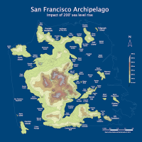
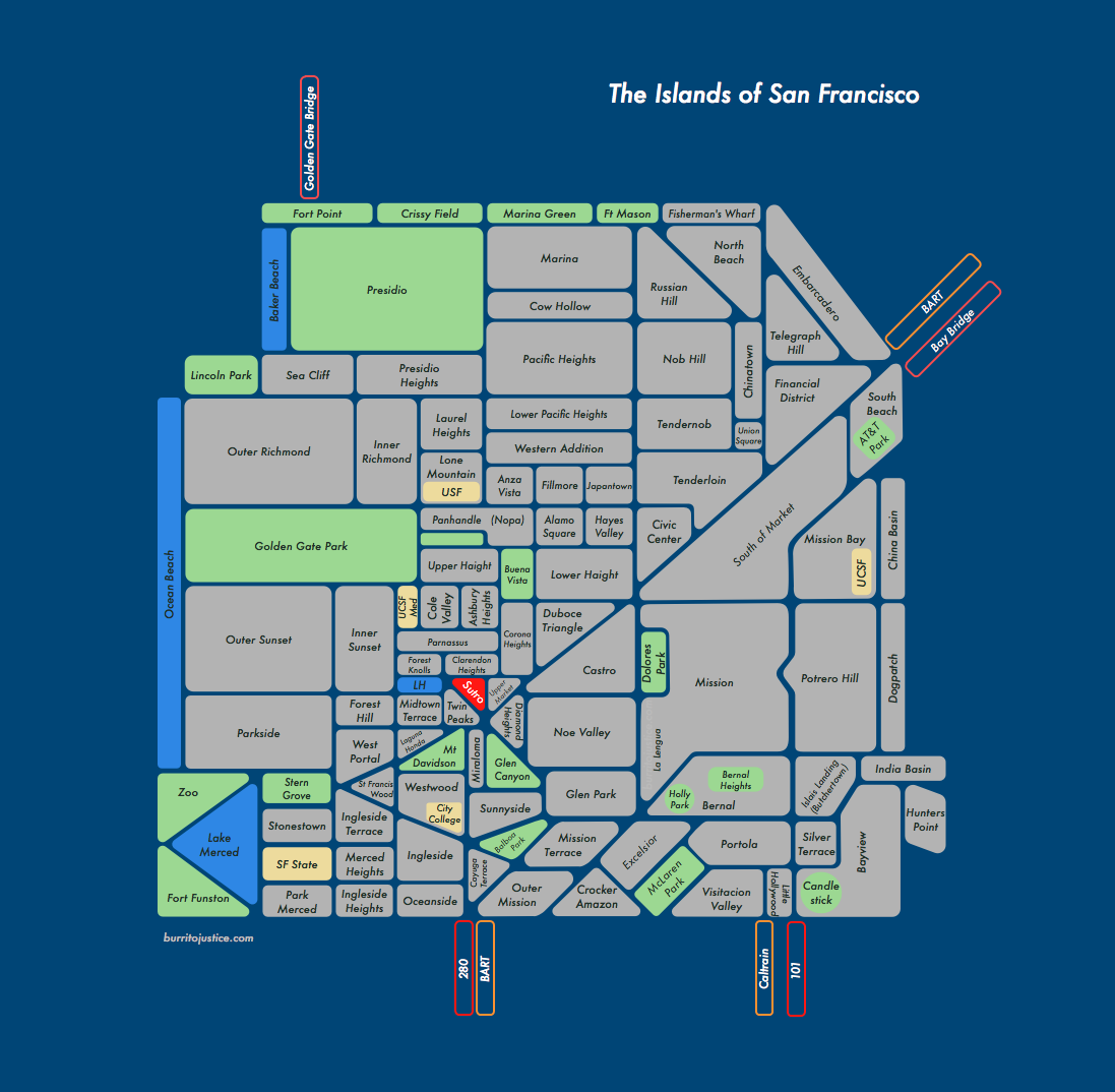
The Islands of San Francisco
If San Francisco neighborhoods were islands, and the streets canals:

2011 UPDATE: now available as a poster!
Click to zoom. (I’ve really got to figure out a wider WordPress template.) Updated May 9, 10, 11, 12, 14, 16, 17, 19, 26.
Map inspired by Kyle Sluder’s SOAS (Seattle on a Sheet). Unfortunately Market St, Columbus, Mission, Geneva/Ocean and 280 make it impossible to follow Kyle’s rectilinear model, but I think it worked out rather nicely.
Man, the more I think about it, canals would be AWESOME. (Panorama, click to zoom.)


(Water images borrowed from here, lost the link to the kayak shot, v. sorry Internet.)
And don’t forget the future canals in Mona Caron’s mural at 15th and Church:


Things I learned:
- Yes, I probably left some stuff out, and yes I probably hosed the alignment of your hood. Please don’t invade the Mission, just let me know in the comments.
- SWSF has a ton of little neighborhoods that I am barely aware about, never mind know the borders of – I guess Republicans like tiny neighborhoods?
- Ingleside is a bit of a mystery – you seem to be non-contiguous. And Merced? Do you really exist? Thinking there’s some serious consolidation opportunities down there, not familiar enough with it to make a call. I hate to use Stonestown as a neighborhood name but hey, there’s an Apple Store there.
- I really don’t know where Downtown and the Financial District start and stop. And I don’t think Embarcadero is really a neighborhood, but you know what I meant.
- I like the look of the Market, Mission, 101 and 280 canals.
- Shapes with rounded corners are a bitch to align.
- UPDATE: v2: nudged a bunch of borders, modified Silver Terrace/Bayview, added Telegraph Hill, Lone Mountain, Anza Vista, Ashbury Heights, Parnassus, Caltrain (v1 is here (if you have too much time on your hands)).
- UPDATED UPDATE: v3: modified Oceanview, Ingleside, Sunnyside, added City College (much easier to see where Ocean Ave is); added UCSF Medical Center, Mt Davidson, Stern Grove; tons of modifications around Twin Peaks (easier to see Portola canal), adjusted Laguna Honda hood vs lake (WTF?), shrunk Twin Peaks; shrunk down the Zoo / Lake Merced / Funston (v2 is here).
- SURPRISE SURPRISE: v4 brings us Dolores Park island, Hospital Curve, and endless tweaking of the Twin Peaks neighborhoods (v3 is here).
- FIFTH TIME’S THE CHARM: v5: adjusted Sea Cliff and Presidio Heights; bifurcated the Sunset and Richmond; once again screwed around with Mt Sutro and friends; added India Basin and adjusted Hunter’s Point; added China Basin; added Union Square; adjusted Civic Center and Tenderloin; and perhaps most controversially, I added the Tendernob. Comprehensive twitternet research has revealed that it absolutely is a neighborhood, while completely not one, sort of a wave-particle duality. It’s Schrödinger’s neighborhood. (v4 is here)
- GROWING WEAK, OXYGEN LOW: v6, good god, it just doesn’t stop. But really wasn’t happy with the area adjacent to 280 (especially the catch-all Outer Mission) so redrew it to better show Ocean and Geneva which turned out to be a HUGE PAIN IN THE ASS. Yes, I know Cayuga Terrace / Mission Terrace / Balboa Park aren’t that large but the scale gets seriously wonky in that part of the map. It just wasn’t possible to get O+G as a diagonal line. Also corrected Visitacion, re-added Merced Heights. (v5 is here)
- HAIGHT MACHINE: v7, since apparently Upper and Lower Haight don’t actually touch at Divisidero (who knew?) and there’s no clearly defined name for the DMZ between Masonic and Divis (though I am partial to SOAK — South of Oak.) So I decided to piss everyone off by flanking Buena Vista and the Panhandle as a buffer between the warring tribes. And while I was at it, I double labeled the latter as Nopa just to further annoy those who don’t like the name. (For the record I am suspect of Nopa, but a) people know where it is and b) this is after all a map. (But I refuse to InterCap it.)) Added Clarendon Heights; also lots of tweaks to Cole Valley; and Parnassus, WTF, are you trying to circle Cole Valley? You stay up on the hill, I am calling your lower section Ashbury Heights until someone bitches about it. (v6 is here)
- INDUSTRIAL ZONE, WESTERN SUBTRACTION: v8 – Sunday Streets taught me there’s a big difference between Silver Terrace, Bayview and my inelegantly moniker “Industrial Zone” (between 280 and 101). Also modified Western Addition, and unfortunately included Lower Pac Heights (ugh, what a stupid name, but people know where it is, sigh…) Western Addition is a tricky one because of historical significance — once vast, at this point is it seems more of an overlay of AV, Fillmore, JT, HV, AS, and Nopa? So do we start doing islands within lakes within islands? (v7 is here)
- BUTCHERTOWN, ISLAIS LANDING: v9 – The warehouse/industrial area between 101 and 280 doesn’t really have a name but I’m hard pressed to call it Bayview since it’s not residential. 80 years ago it was the marshy outlet of Islais Creek, and the adjacent area near 3rd was called Butchertown.
So using the powers vested in me by this blog, I hereby declare the area as Islais Landing / Butchertown (because let’s face it, Butchertown is too cool a name to waste). Also widened the blue border to make it more sea-like, and added a title. Appended ‘Hill’ to Potrero, and added Holly Park because a) I like it, and b) it seems different than Bernal. (v8 is here) - DIVISIDATION: v10, per recommendation of natives, flipped Western Addition and the Anza Vista/Fillmore/Japantown row. But as previously noted, that whole area is tough to do since Western Addition is both an overlay (Van Ness to Divis) as well as a container for other historical areas (Fillmore) and trendihoods. Sadly my efforts at drawing an archipelago of Fillmore-AV-JT-HV-AS in Lake Addition have failed. (v9 is here)
- POSTER TIME: St. Mary’s and a few tweaks. Do go and Zazzle yourself a poster here.


