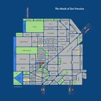
New BART Map Disrespects History
I am not liking the new BART map:

The old BART map:

The new BART map, with its laser-like cut from downtown to suburbs, is a slight upon the history of this city. Mission Street curves — deal with it bitches. You can feel it between Civic Center and 16th. Don’t fuck with the Old Plank Road or I’ll challenge you to a duel.

(Oddly rotated by 45 degrees to fit the tyranny of the WordPress 450 pixel width limit…)
Plus they are increasing time between trains to 20 minute from 15, despite raising fares. Seriously — are they trying to get fewer people to ride BART? Thank god they’ve got the customer service angle figured out. Idiots.
UPDATE: Intense discussion on how far one should go to simplify a transit map let me to create this hyperlinear BART diagram in a reductio ad absurdum exercise. New post here, comparing how the London Tube map handles curves on the same scale as the BART map.

I must say it is growing on me. (But I still want to Preserve the Curve.) More discussion in this post, with a surprising scale comparison to the London Tube map. Not what you’d expect.
Trackbacks
- Today’s Mission: 09.17.09 | Mission Loc@l
- Hoy en la Misión: 17.09.09 | MissionLocal: Spanish Language Version
- Mother Mother « spume
- A Makeover for the BART Map | BookinEarth Blog
- Rare Hectic Energy vs Slavish Geometric Inaccuracy « Burrito Justice
- Google Maps, 1853 Edition « Mission Mission | The Maps Blog
- Transit Maps: Unofficial Map: San Francisco BART Reductio ad Absurdum


Subway maps aren’t supposed to respect history, they are supposed to be simple and easy to read. There are plenty of bends in the tracks that weren’t shown on the old map.
Erik, I have no problems with smoothing out lines for maps. But a straight shot from Embarcadero to Daly City is a line to far. That’s at least three different street grids it ignores.
Maps are History! Return The Curve!!
OMG and the Thames doesn’t flow in rectangles and triangles through London either! It’s a subway map. Once you’re underground the street grid doesn’t matter.
One of the most asinine whines ever.
Thank you Jay. I am glad your finely-tuned asininity detectors drove you to take the time to respond with such a perceptive and thoughtful comment.
And Jim, what are these “rivers” of which you speak? (Ha ha, trick question, we don’t have any.) Anyway, by your logic, the coastlines should also be recti-angular but they are not. They need to either pick one or the other, otherwise this map is half-assed.
actually, this is the way BART maps looked before the extension past Daly City. It’s Old Style!
Ironing out the kinks in a route-finding map makes sense when the routes are complicated enough. The London and Paris metros are real noodle bowls, big loopy tangles with many, many transfer points from one line to another. Displaying these in such a way that they conform to actual topography would only further muddle the matter. So yeah, these rigid angles and straight lines make sense for that kind of thing.
BART, on the other hand, is much simpler system, with much larger average distance between stations, with far fewer meaningful transfer points. I think it’s rather useful to understand the overlying geography in this instance. I preferred the old map.
I agree that the coastlines should be simplified to match. (Do we really need to see the estuary in Foster City?) But this half-assed redesign is at least a step in the right direction. That uber-literal wiggle out to Pleasanton always annoyed me.
Zenvelo is right. OP is a noob.
Zenvelo is correct. Here (http://www.flickr.com/photos/jef/65736181/) is a good representation of the original map made for a movie. Notice all the straight lines?
Totally agree with you on that Pleasanton wiggle. But I’d still argue that the Mission curve is one of navigational significance, especially for tourists who really need the map.
Goddamned liars! Turns out all these trains run on two tracks; by the map I thought there were 4.
Why is it important for passengers to know that there is a curve between 24th and Glen Park?
i don’t really understand the point of making a map less accurate, both in straightening out the routes but also making the stations look like they are equidistant from one another. 16th street to civic center isn’t the same as powell to montgomery.
also the new font sucks.
If you are on a subway then the only thing that matters is the order of the stations and places where you can transfer to another line. Curves and relative distances are nice but irrelevant.
yeah, thats not true. sometimes i look at maps to see whether it would be worth it to pay for the train, or if i should just walk. thats when it’s nice to see how far apart the stations actually are from each other.
i.e. i would probably pay to go from 16th to civic center but if i paid $2 or whatever, i’d be pissed if it was the 2-3 blocks between montgomery and powell.
Then you need a street map, not a subway map.
Erik, I completely disagree with you. This screws me over in London all the time. There’s a balance to be struck between simplification and accuracy, but an indication of relative position is extremely valuable to me and apparently to others. This guy in the UK comes up with some good points on how the London Tube map can be deceptive.
As for the curve, Glen Park to 24th looks totally walkable when it’s not, as do many other stations.
why purposefully make a map less accurate, necessitating TWO different maps of the same area? thats silly.
I feel it, what your saying, but the new design is more historical in the subway milieu. That’s the way they’ve been drawn all over the world, straightening lines, using 45′ angles, and equi-spacing stations. It’s all for the good of comprehension.
The whole deal of maps is a funny thing anyway, trying to flatten a sphere. Remember the Wide World of Sports logo/projection from the late sixities? It was some kind of interrupted projection. Is a mecator the best, is Canada and Greenland really that large, is Russia that small, are there sea-dragons at the edges?
I love to study maps, I especially like finding the made-up places mapmakers add as a watermark.
You have to balance accuracy with simplicity. A subway map is supposed to tell you how to get around within the system, any information beyond that may be useful but also adds noise and makes it a little harder for someone unfamiliar with the system to figure out how to get where they are going.
A map that showed you how to get around on BART and also gave you good walking directions between stations might be more accurate, but would have to be huge to be useful. The time to be making an informed decision about walking, Muni, BART, or driving is not when you are looking at the system map on the wall in the station.
http://www.treehugger.com/galleries/2009/07/worlds-most-impressive-subway-maps.php
I do agree on the challenge around that balance. It varies by audience — commuter or tourist.
This also presumes that your destination is near your station. I know when I travel it usually is not, and more context can be valuable (but I certainly don’t want a 1:1 map).
You can take it too far in either direction — here is my reductio ad absurdum effort at the simplest BART map possible, focusing only direction and station order and abandoning any effort and preserving geographic distance. The ultimate example of this is a line map of a route — useful when you are on a particular train. But as for a system map, I think a hint of geographical accuracy go a long way to bringing them to human scale, thus my pedantic clutching to said curve.
That would be a very good map if the bay itself weren’t such a significant geographic feature of the area. Maybe add a squared-off representation of it a la the Thames.
Also, a system map isn’t for commuters because they very rarely need it.
And thus the crux of this debate — where do you stop with map simplification? If “only thing that matters is the order of the stations and places where you can transfer” then why is the bay important?
It makes it easier to locate your destination station on the image. It’s definitely not necessary though.
I live in London but I’ve lived in San Francisco for a while this summer. I think what BART has done here is got itself in a total tizzy. Either you have a totally geographic map (as it was when I was in SF) or you have a totally schematic map (see the London map). It is perfectly acceptable to have one or two bits of stylised geography on the map like the Thames or Seine or major parks and it’s often chaotic when taken away like in London this week when they took the Thames away.
So BART needs to make up their minds as the new map looks absolutely awful with the D/P’ton line just jilting off at a totally different angle from PB/B’Point and the Richmond lines. It just looks messy. If you’re going with a schematic map make all angles exactly the same (just like back in the 70s) and make the Bay fit around the lines. If I get any time between packing up to go to College and sleeping I might make a mock up of what I mean (I did make a schematic BART map when I was about 10, I might dig it out)
Yah the time increase is just ridiculous and the shutting down at midnight is so making my life difficult and stranded. They should offer $50 cab ride gift certificates.
Cartographically speaking, subway maps are supposed to only have straight or 45 degree angled lines. If BART wanted to make navigating the system more intuitive and easy, it would refer to the different lines by Color and Directions, like the “Red Line towards Richmond”or the “Yellow Line towards Pittsburg/Baypoint”.
Furthermore, pick one destination name and don’t add slashes to make it more difficult. I like the simpler old school BART map myself, bus line maps need to be more geographically acurate. The more regional the transit system, the less precise and more general the system map and stations needs to be.
Does anyone know what the address of SFO? Nope, because it doesn’t matter.
Свобода слова на блоге – это всегда хорошо! Самое главное, чтобы общественности было что автору сказать :)
Что-то у меня в Файрфоксе дизайн вашего сайта расползается…
Get over it. Fuck the Mission.
I’m really glad they changed the map. I was in San Francisco last month on vacation and took the BART by myself for the first time. I’m generally a good navigator, and comfortable with maps, so I was able to figure out the old map without too much trouble. However, I thought it could be a lot simpler. I understand that the ‘Mission Street curve’ is important to local residents, and well, to geography itself, but my main concern when riding the BART was knowing which station came after which, and the general area of where it was, i.e. downtown, or in relation to my starting point (Daly City). I would never use a subway / train map for navigating through streets, as I would already assume that the map was simplified for information purposes. Those are just my thoughts. I am absolutely enamoured by maps of all sorts, and geography in general, but when riding a train these things are irrelevant. I was concerned only at arriving at the proper station. I hope that gives some insight from a tourist (who does happen to appreciate city grids, and geography), but I do see where you’re coming from.
I’m looking for a map that shows the ACTUAL path that BART takes when underground. Any links?
The previous system map pretty much does that, but probably not on the scale you’re looking for.
The planning docs for the 30th St BART station have detailed maps of the existing tunnels.
The Transbay Blog has a rather impressive set of track maps for BART, including switchback and grad.
Добрый вечер, мы хотели бы проинформировать вам о новейшем обворащительном новостном ресурсе Нефть – угрозы и возможности.
Тут вы увидите достаточно любознательной и информативной комментариев о тендерах, экономическом кризисе и голубых фишках. Ты сможете так же просмотреть поучительные видео презентации, которые помогут тебе знакомство с информации в таких понятиях как брокеры и торговая система.
Одной из особенностей рассматриваемого новостного портала является интересеная вариант подачи знаний для вновь прибывших участников, которая заключается в неспешном погружении с практической частью курса. С мнениями касательно упомянутого портала вы сможете познакомиться на форуме. Полученные знания помогут лучше знакомиться с текущими экономическими ситуациями делами в мире. Похожие обсужденияТехнический анализ
johnny0, I thought you’d appreciate the appearance of the original BART map in this b&w photo from the first BART trip in 1972: http://www.sfgate.com/bayarea/article/BART-at-40-looks-to-build-on-triumphs-3854933.php#photo-3436350