Year of the Bay, California Historical Society
There are many reasons to like the California Historical Society on Mission between Third & Annie. They have an awesome building that is painted International Orange.

Also, part of it once housed a saloon in 1887:
As for now, it’s full of historical records. It’s currently focused on the Year of the Bay, a project that aims to collect photos, videos, and stories from everyone to tell a better story of the history of the Bay Area.
The exhibit is perfect for your lunch hour or a weekend stop.

Lots of maps, naturally:
Some detail from the 1927 Coast Survey map (no bridges):
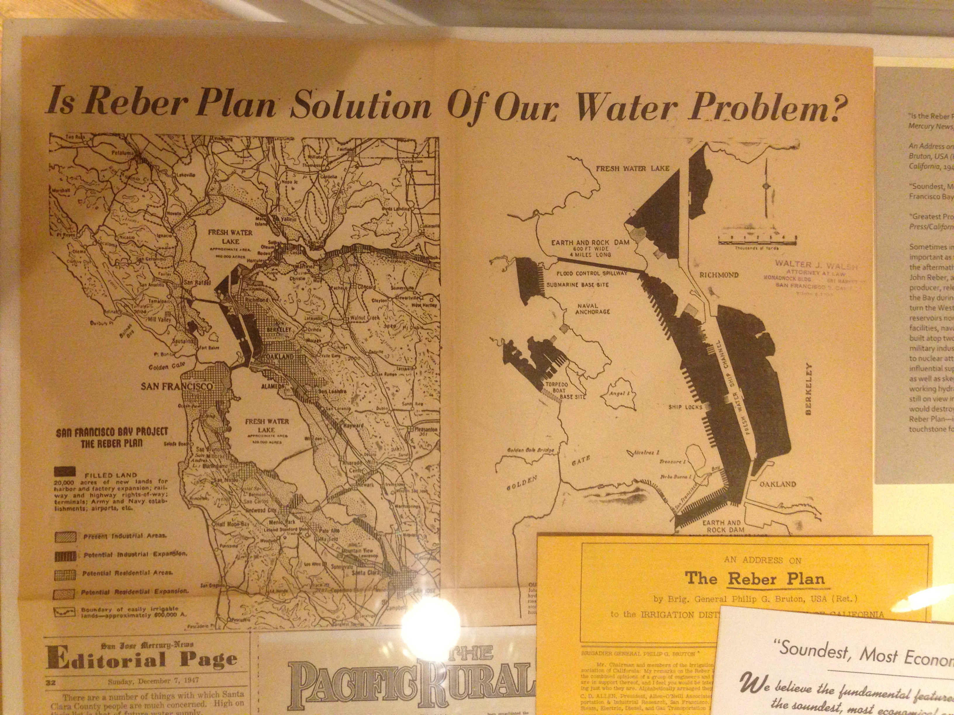
The absolutely insane Reber Plan to dam the Golden Gate:
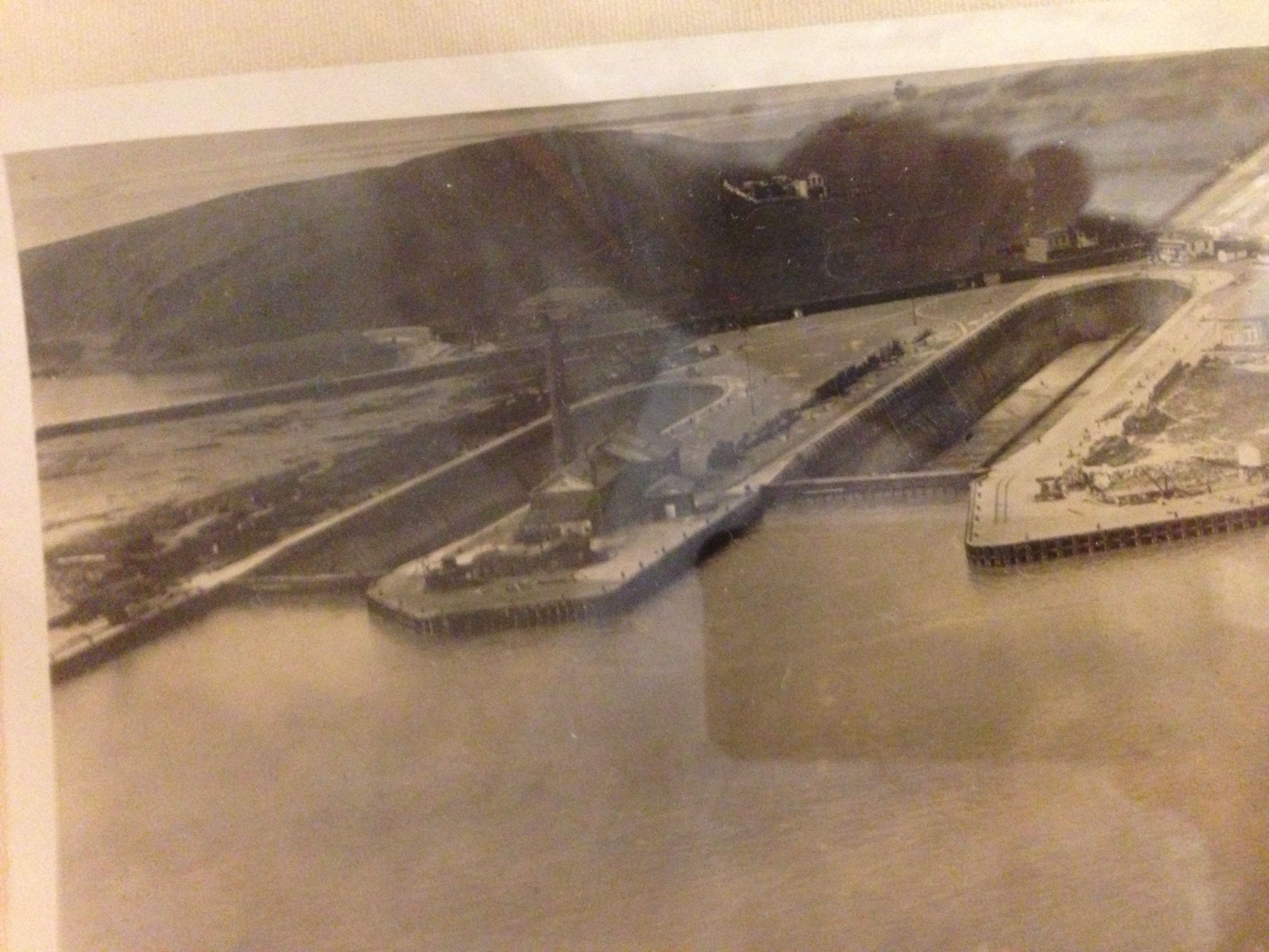
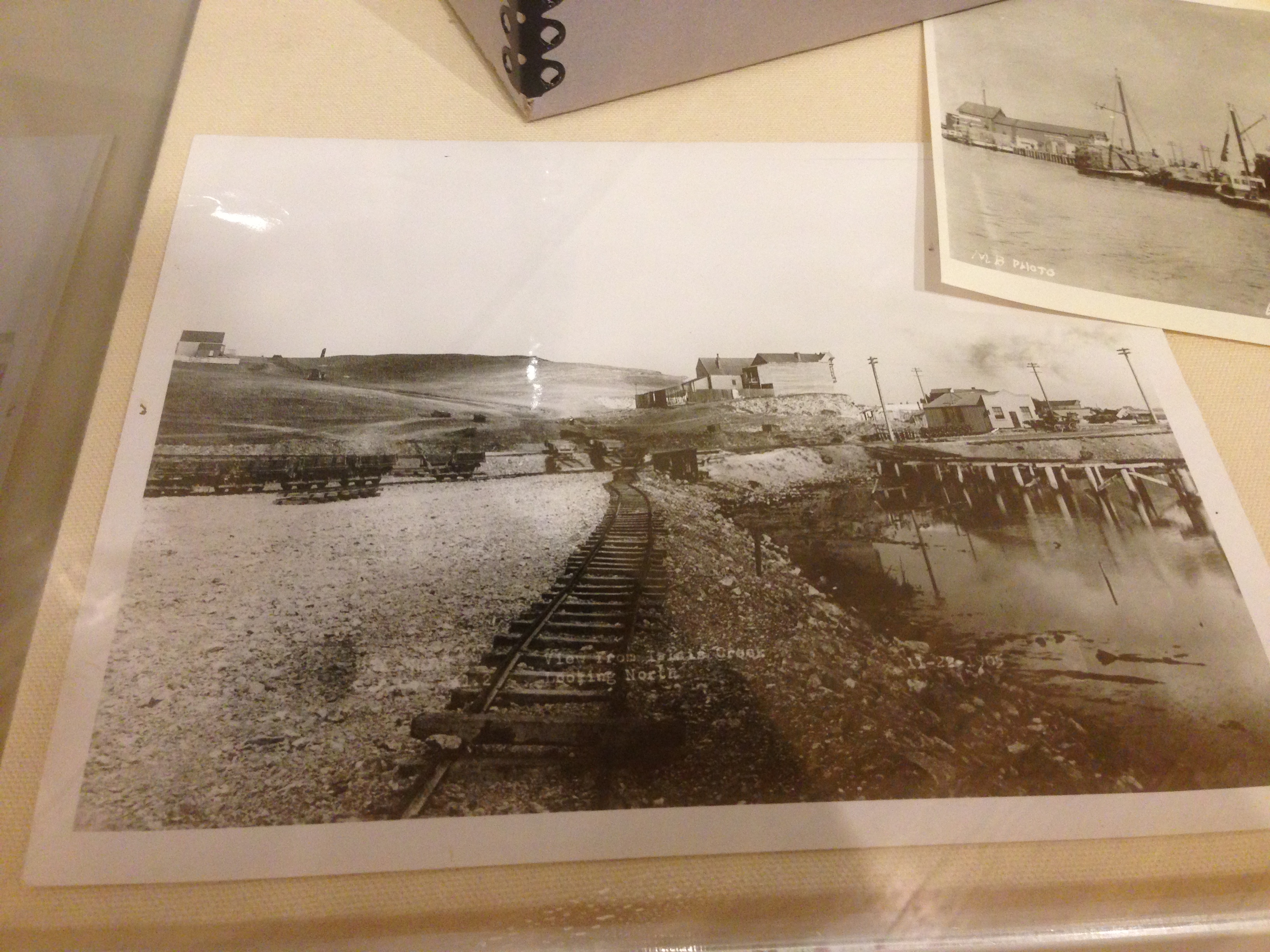
Lots of historical photos of, including Hunters Point and Islais Creek in the mid to late 1800s:
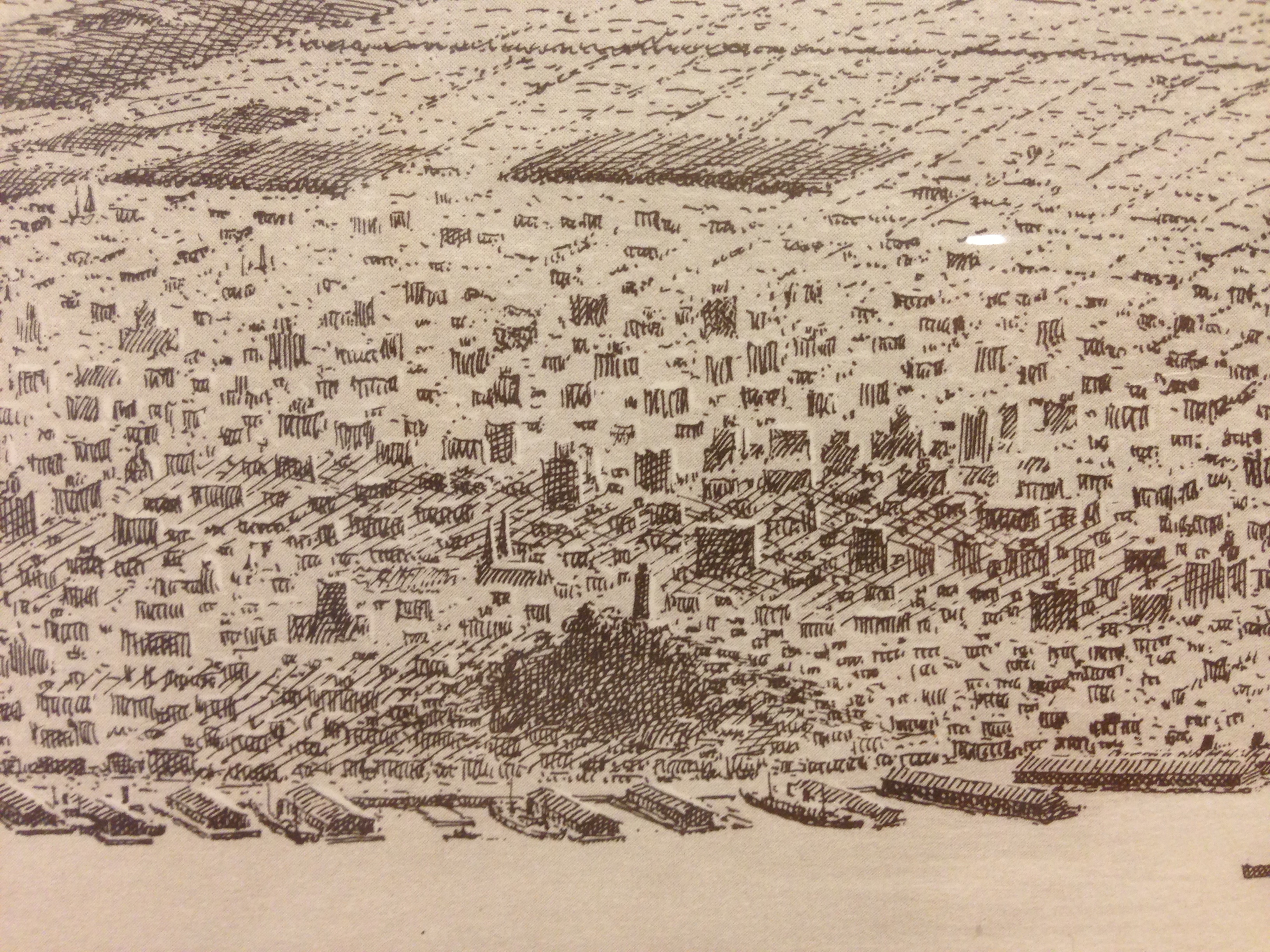
I was most surprised by the sketches and paintings. The crosshatching in this aerial view of SF is amazing:
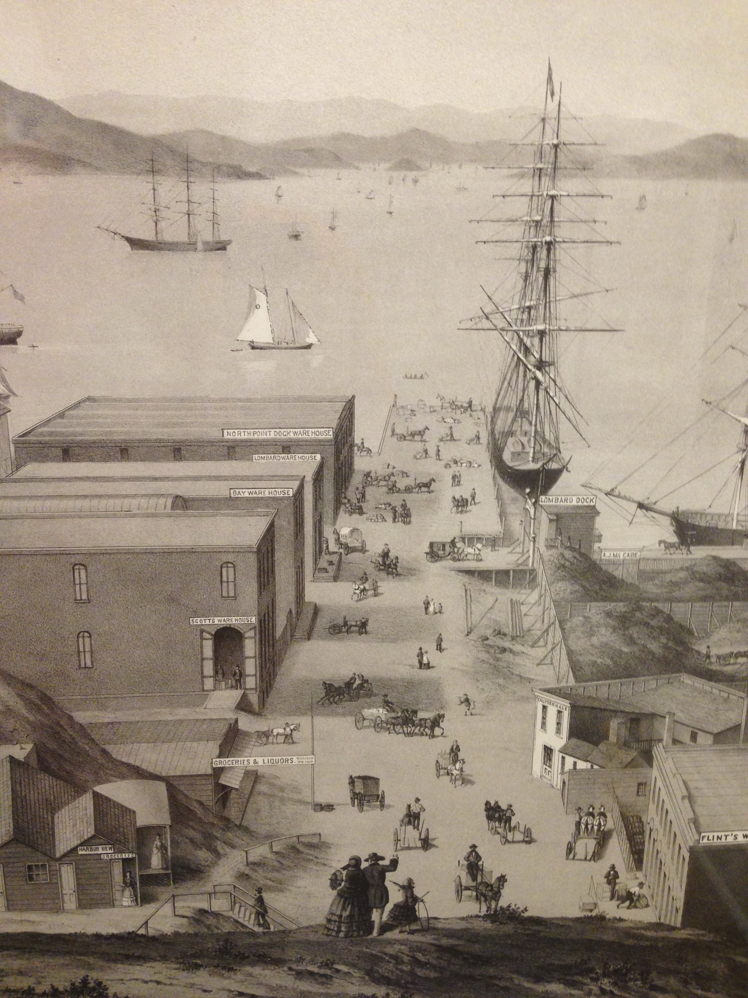
Incredible detail in this drawing of the Lombard, North Point and Greenwich docks:
Ladies shopping.

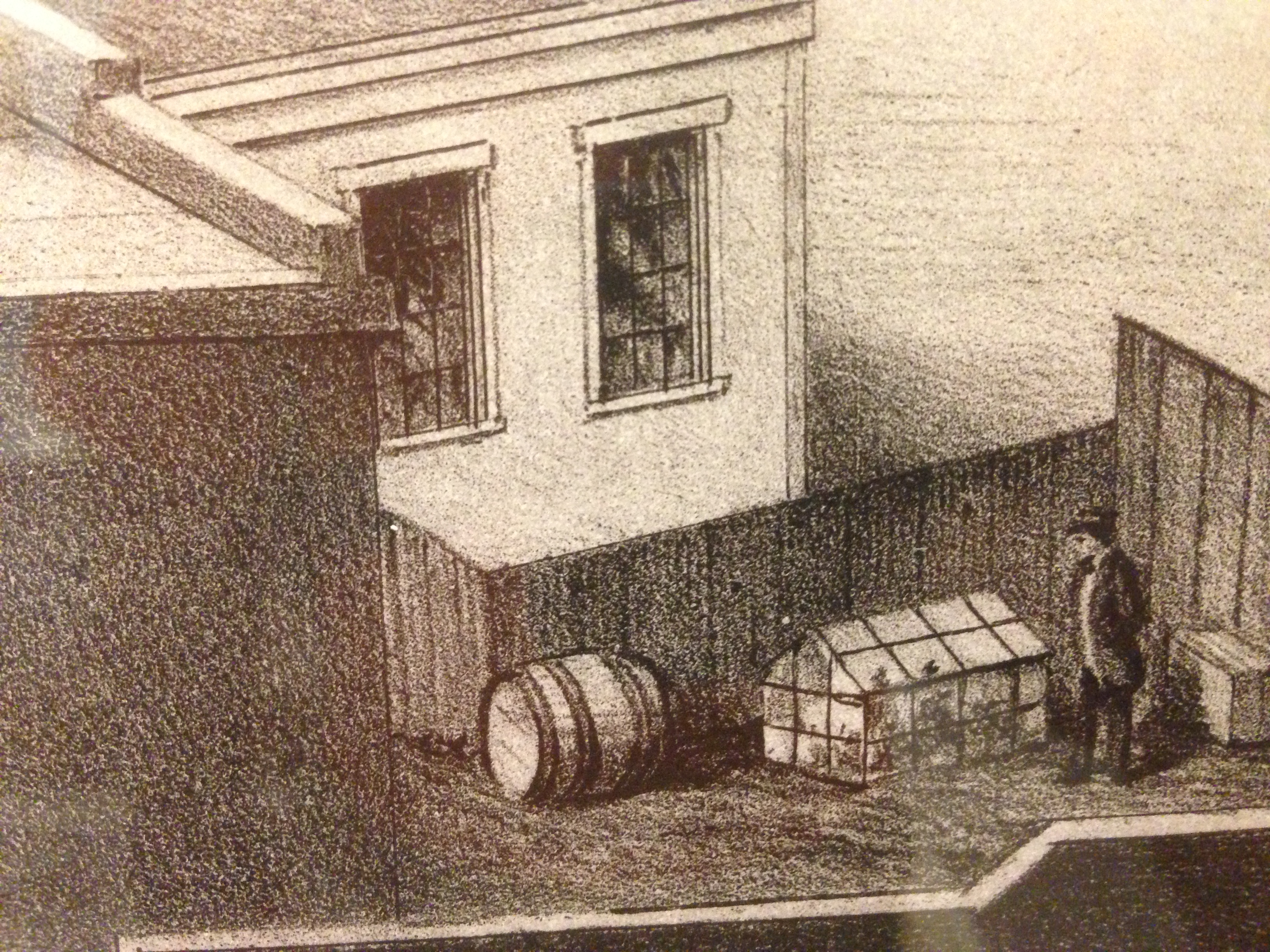
Not entirely sure what this guy is doing. Probably a grow-op.
California Ale!

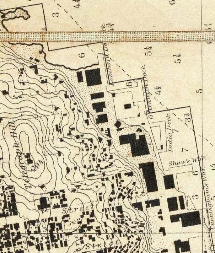
You can see the Greenwich and Lombard docks at the foot of Telegraph Hill in the 1859 Coast Survey map:
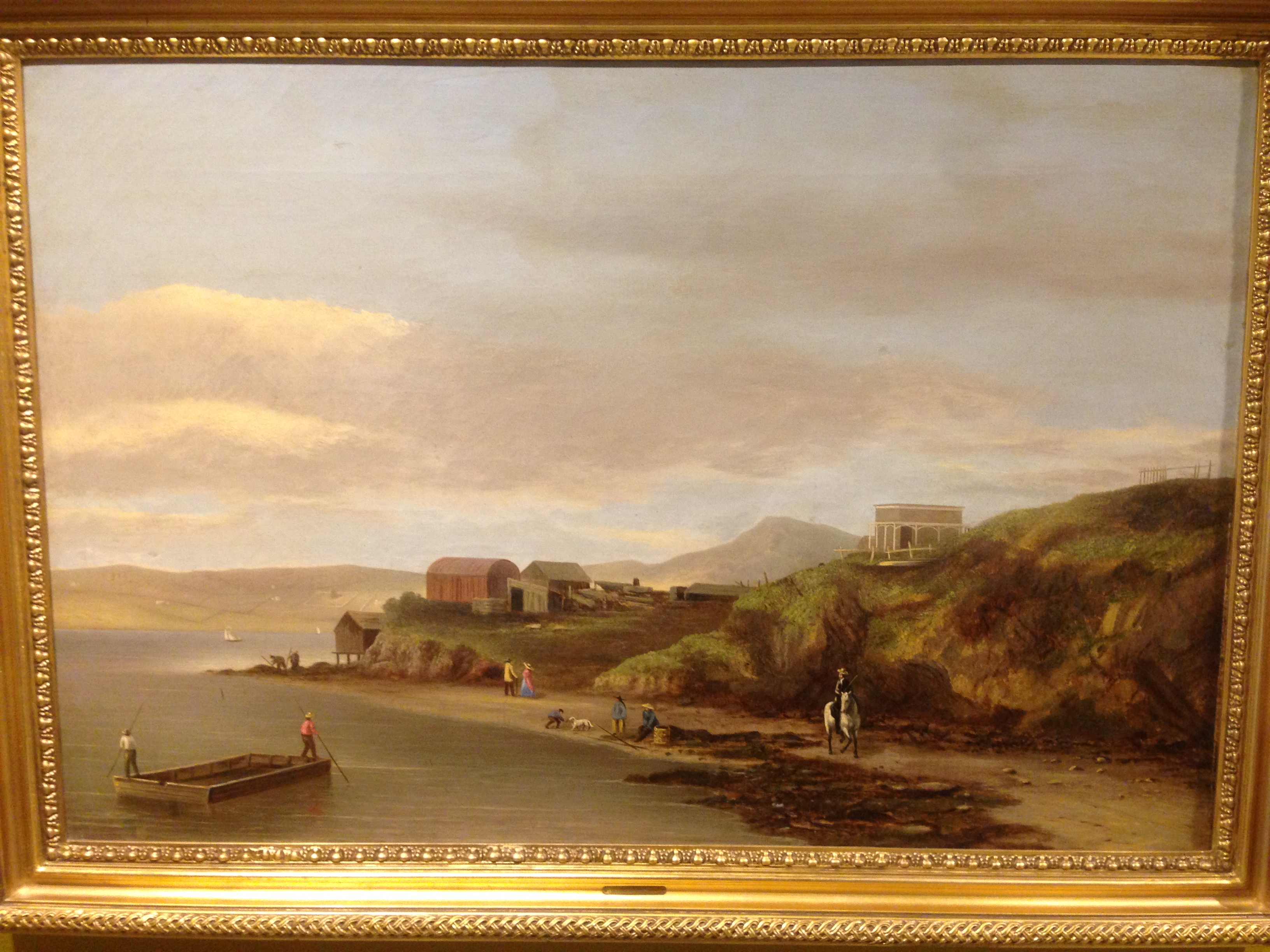
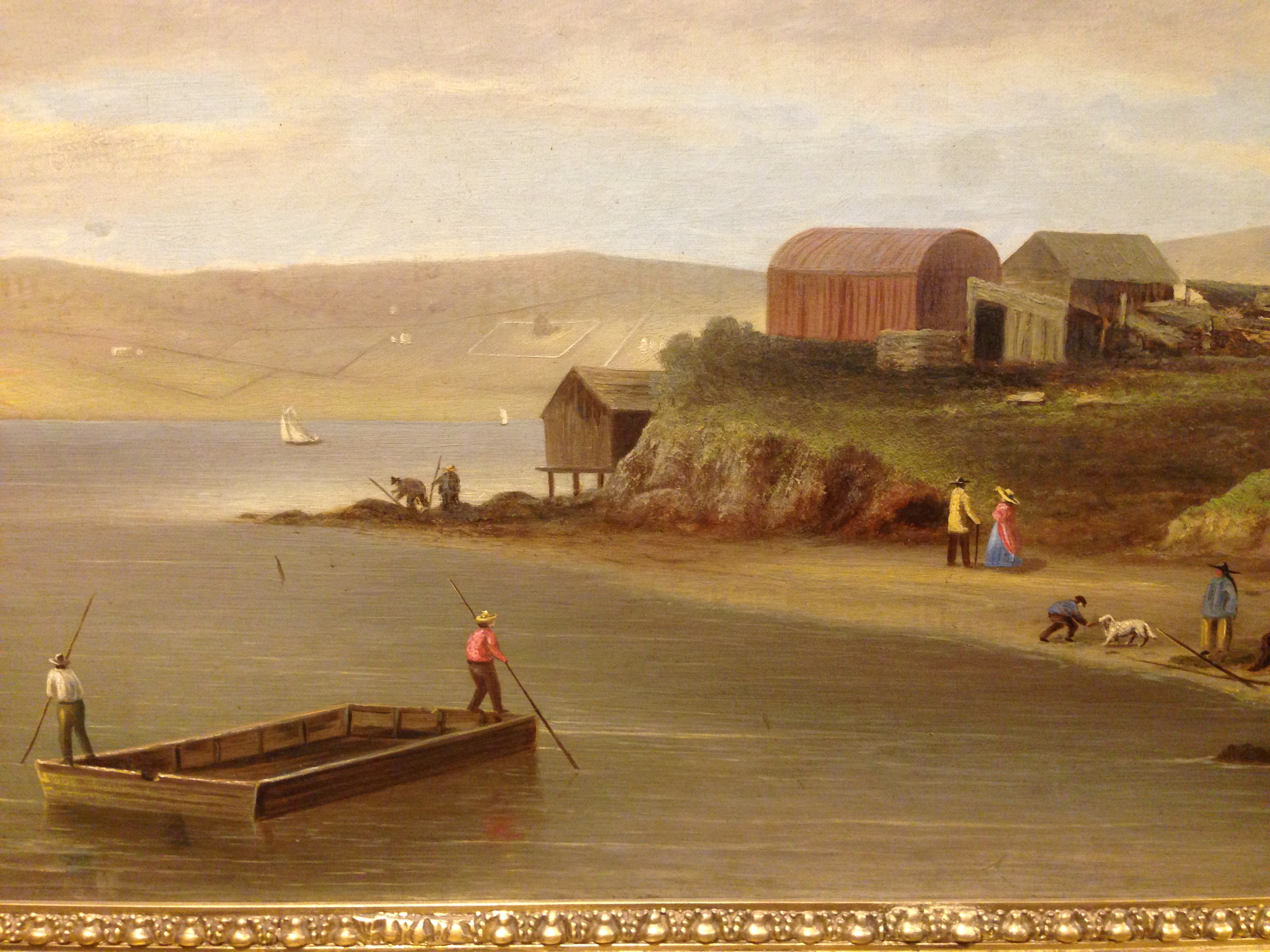
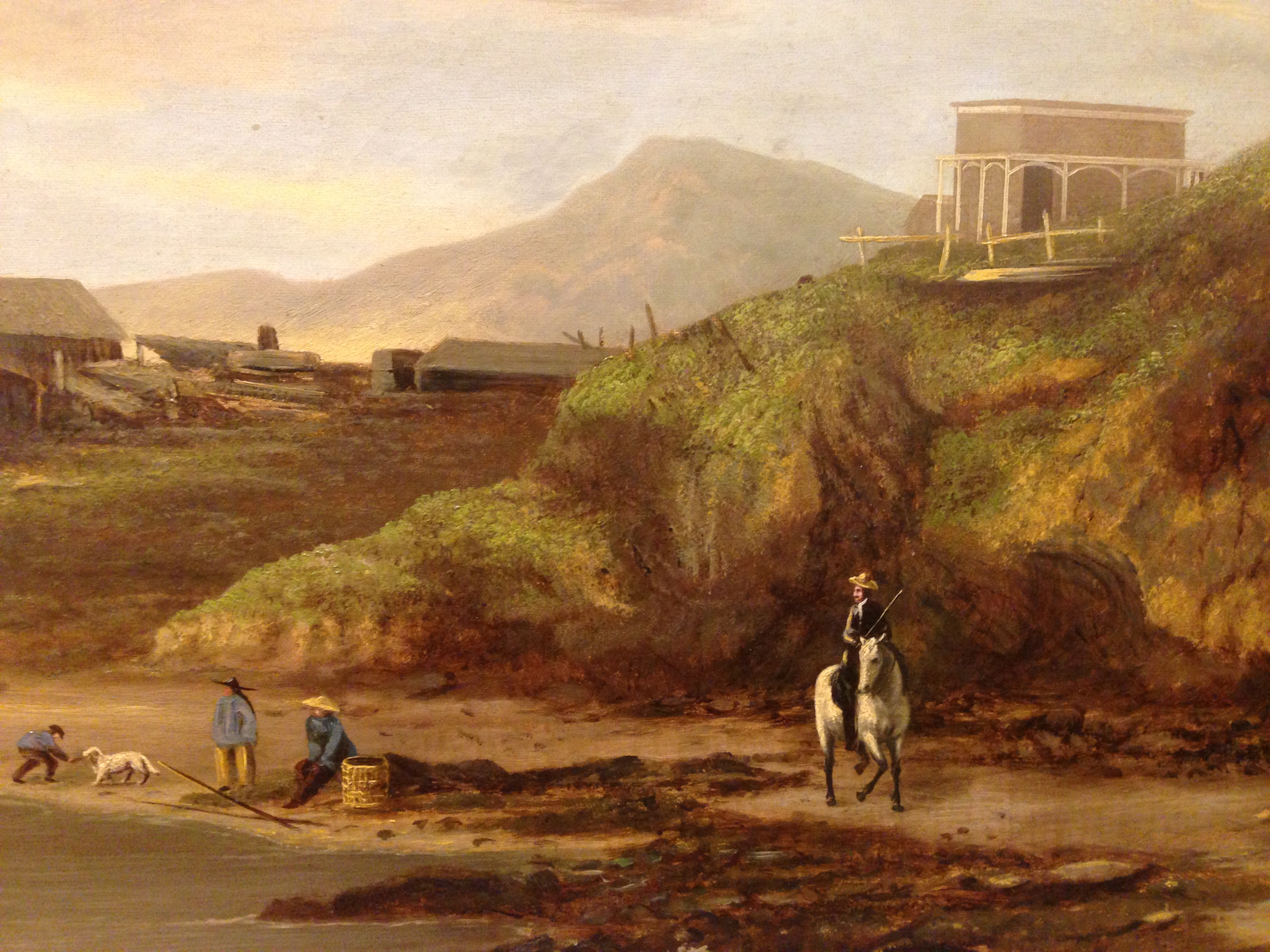
Then come things that take you to another time and place. This painting of Hunters Point in 1859 is a little surreal, showing a very different world:

Anyway, the California Historical Society exhibit is well worth your time, as is the Year of the Bay / HistoryPin website.
Don’t Fuck With Beavers
Animals as symbols are curious things. Too often they are grossly misrepresented (have you actually heard the underwhelming cry of a bald eagle?)
…ironically extinct (the story of the last grizzly bears in California is pretty depressing)

(There’s much, much more in the Bancroft Museum grizzly exhibit…)
…or just don’t make sense. Lions? England? Huh? Though the Swedish Gripsholm lion is pretty awesome.

This brings us to the de facto animal mascot for Canada, the beaver. Beaver pelts were the business case that made Canada. This is a potentially hilarious animal in many respects, and ironic in others since the beaver was almost driven to extinction by the mid-1800s. But let’s face it, these industrious semi-aquatic rodents have remarkably good PR (and seem to be saving us from our diesel spills).
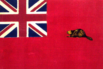
Anyway, in 1964, Canadians got tired of not having a real flag. (The Red Ensign, a Union-Jack-in-the-corner flag you see so often in former British colonies, had been used since the 1860s.) The Great Flag Debate erupted over which symbols to use. Various maple leaf designs were proposed by the government in power, while the Union Jack was favored by those still in love with the British Empire.
About 5900 designs were submitted by Canadians for the flag committee’s inspection, and beavers put in a pretty good showing. The top four design elements:
- maple leaves: 2136
- union jacks: 408
- beavers: 389
- Fleur-de-lys: 359
The University of Saskatchewan has an archive of many of the submissions, and they are as awesome as you might expect. While I am rather pleased with the current Canadian flag, this beaver jack flag is pretty striking.
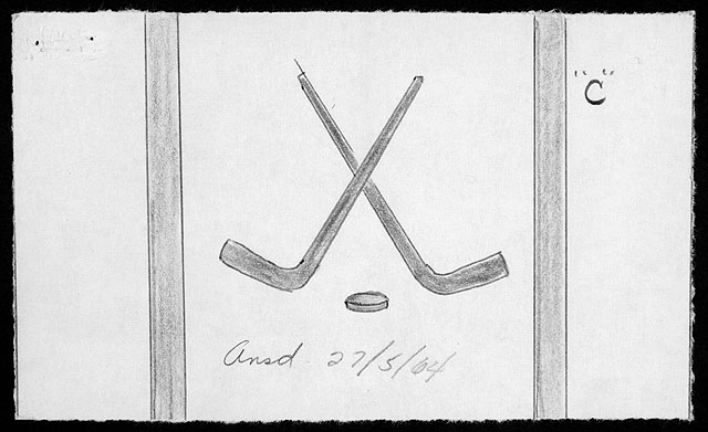
Not all flags were plant, animal or empirically themed. Here we see a design with hockey sticks Canadian ceremonial swords:
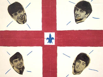
Some designs were reflective of the era:
Anyway, I have taken the liberty of collecting the various beaver-themed flags for your inspection:
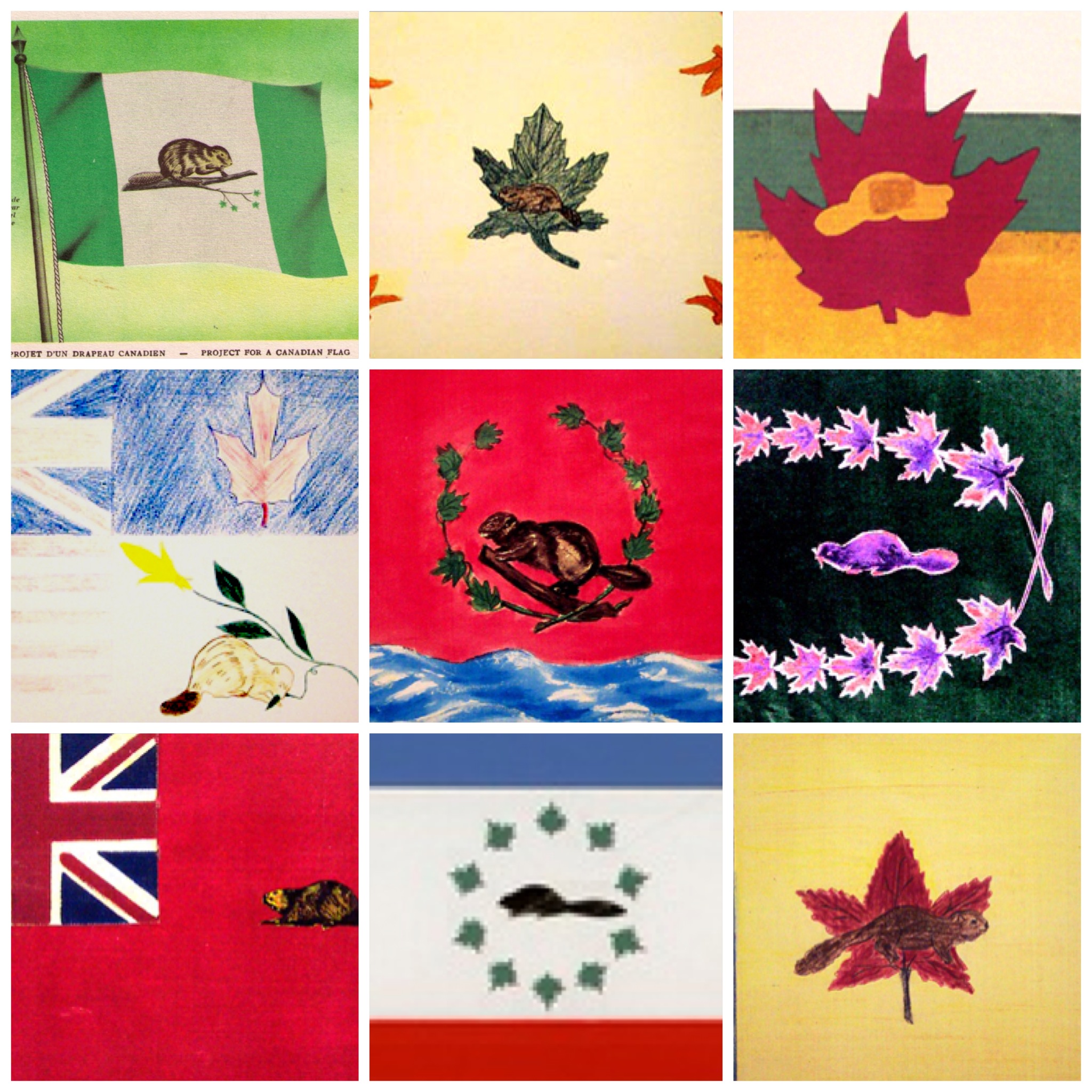
Now before you go mocking Canada for nearly putting a beaver on its flag, I present you with some fairly terrifying evidence of beaver superiority:
Between beavers and hockey, I think Canada is pretty well defended.
3D Print a Sutro Tower
Frequent readers will know that two of my favorite things (next to my family (and al pastor)) are Sutro Tower and 3D printing. The all-powerful @davidnin has combined both, and has created a 3D printed 11″ tall Sutro Tower. BEHOLD THE FUTURE:

(It’s the middle one — apparently David has been experimenting with 3D Sutro giganticism.)
Anyway, a 3D printed Sutro can be yours for a very reasonable $27 via Shapeways, an on-demand 3D printing service. (Now excuse me while I go 3D print a burrito for lunch.)
North American Subway
XKCD presents the Subways of North America, otherwise known as TUNNEL BORING MACHINE MADNESS.
I approve of the new extensions of Muni and BART. This will certainly make it easier to get to Tojo’s and Alegria’s. (Too bad Ben’s is no longer around, though we can now visit Grumman 76.) It also provides us with ready access to Mexico City’s Escondrijo Estratégico de Huarache (Strategic Huarache Supply).
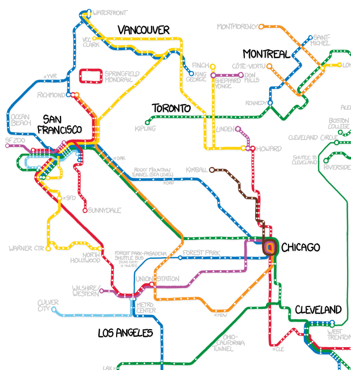
While the northern and southern SF extensions are to spec, there are SERIOUS ERRORS in the east-west connection with the fraudulent and inaccurate “Rocky Mountain Tunnel”. Allow me to correct this.
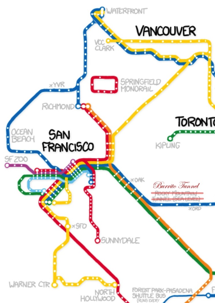
Everyone knows that you would actually use the Alameda-Weehawken Burrito Tunnel (which goes right under Chicago).
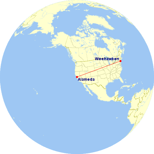
But other than that, excellent work, XKCD! I look forward to your corrected map.
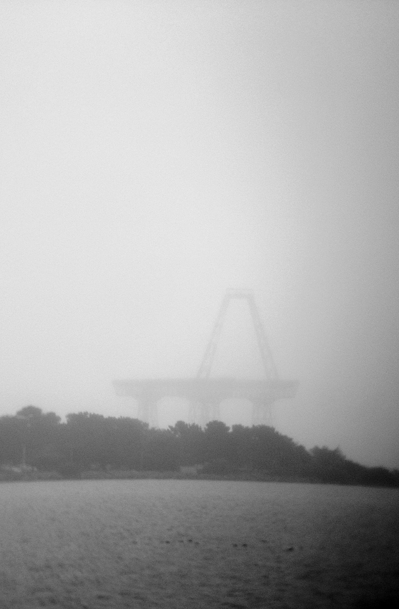
Burrito Railgun in the Mist
Sutro Sunset Rainbow
A glorious sunset in San Francisco. Matched by a rainbow in the other direction. At the same time.
Looking at Sutro from Ocean Beach:
Oh hello. http://t.co/XDc1MvfX1V—
Robin Sloan (@robinsloan) March 31, 2013
Looking at Sutro from Bernal:
https://twitter.com/7im/status/318187376667136001
Looking at Sutro from the Mission:
#sanfrancisco #auroraborealis #nofilter http://t.co/rshEiVTLRy—
Ariel Dovas (@eviloars) March 31, 2013
And for posterity’s sake, a mosaic.
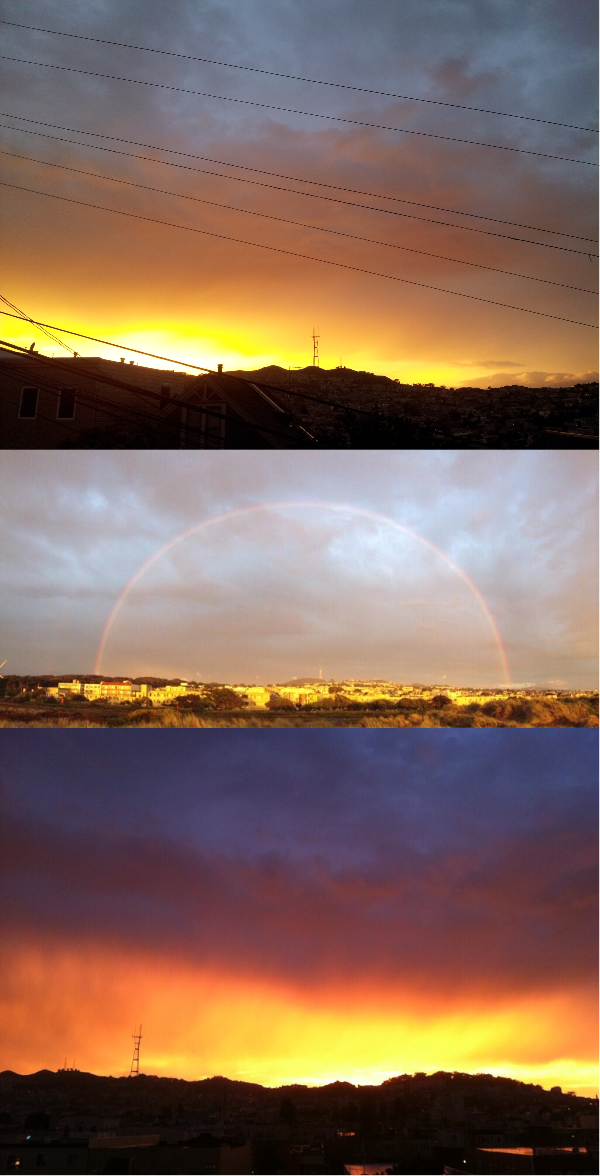
What, no lightning? Mother Nature, what a slacker.
One of these days I will figure out how to deploy a ring of several dozen Sutro-facing cameras in a ring around the city so we can capture things like this in bullet time.
La Lengua, 1907
All hail @sf_historian! Last night they tweeted a Calisphere photo of La Lengua, Noe and Twin Peaks as seen from atop Bernal, supposedly 1906. It was taken from above what will become the Esmeralda stairs.
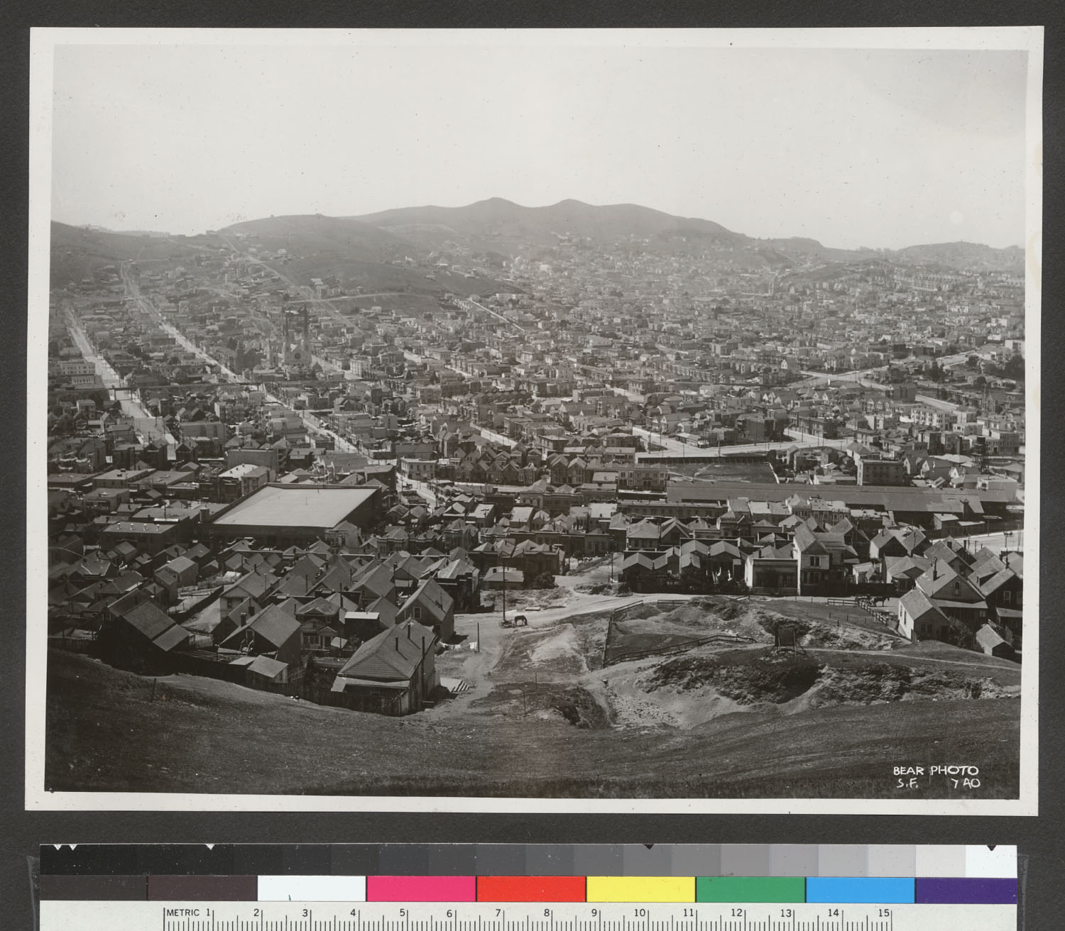
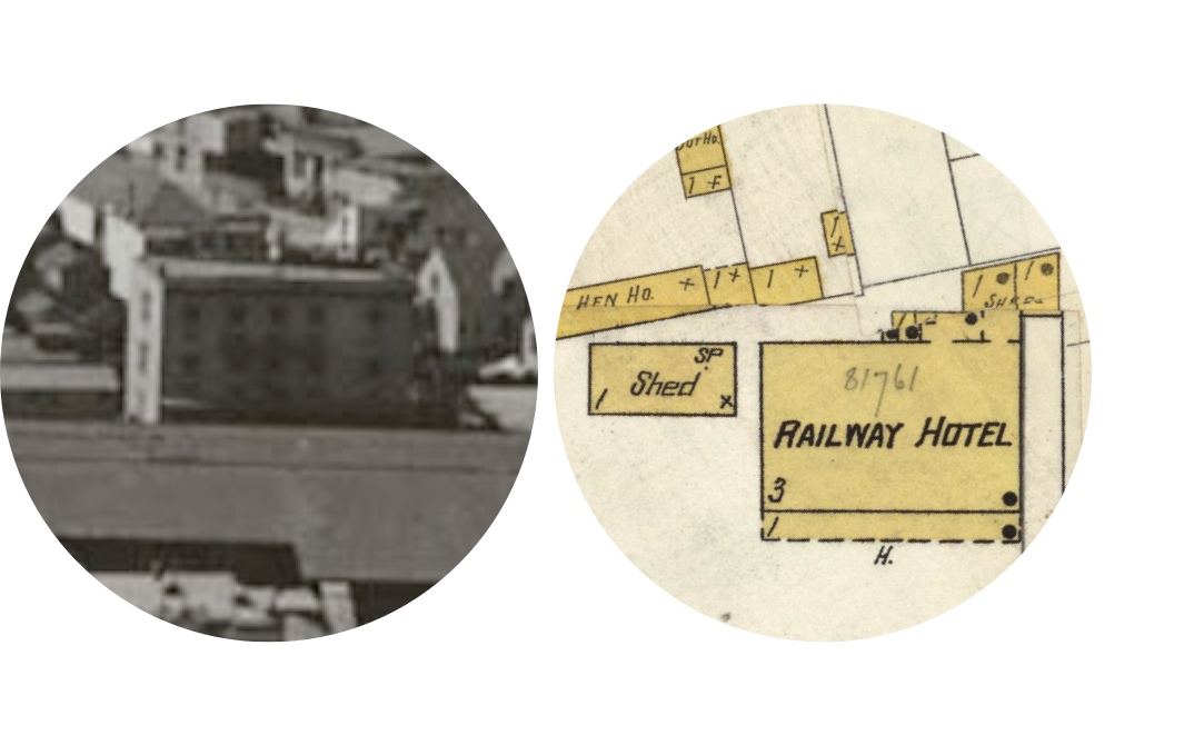
So much here! The old car barn on Valencia & Mission. The Railroad Hotel on Tiffany. The Southern Pacific rail trestles and berms through Noe Valley. Here’s an annotated version (click to zoom)

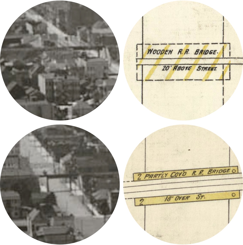
Some detail, cross-referenced with the 1906 Sanborn maps (via Maptcha and David Rumsey)
Southern Pacific rail trestles and berms crossing 29th and Day Streets, between Dolores and Church:
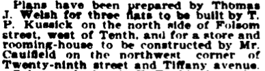
The future home of Rock Bar on the corner of Tiffany & 29th:

which was built in 1901:
I’m pretty sure the building with the curved roof is the old Lyceum Theater (now the Safeway parking lot):

We’ve discussed the Lyceum in previous posts, and Bernalwood did a feature on them last week. However, the Lyceum wasn’t built until 1907, so this photo must have been taken after that. In 1905/06, the Safeway block was pretty sparsely populated:
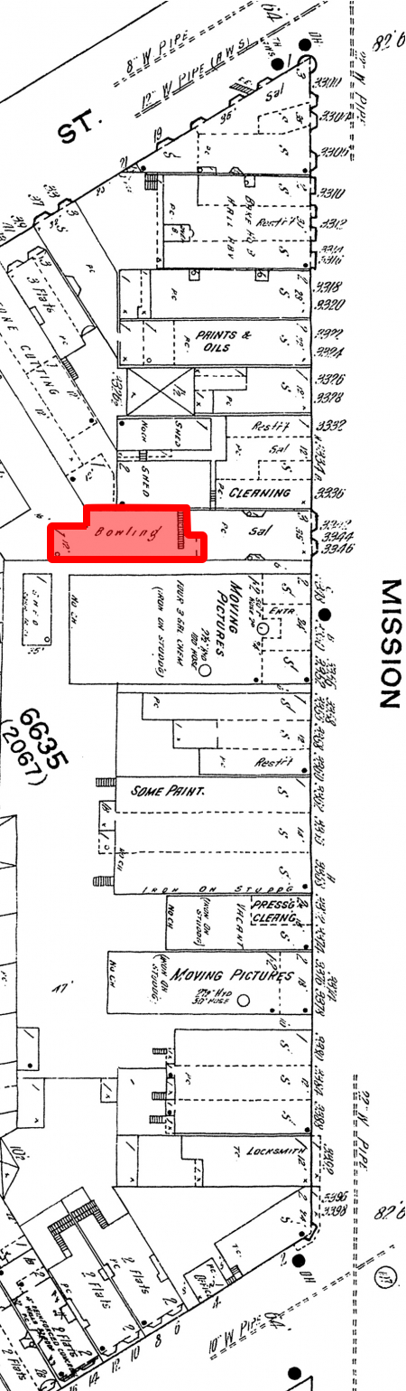
The building immediately to the right of the Lyceum is still standing — it’s now La Alteña Taqueria
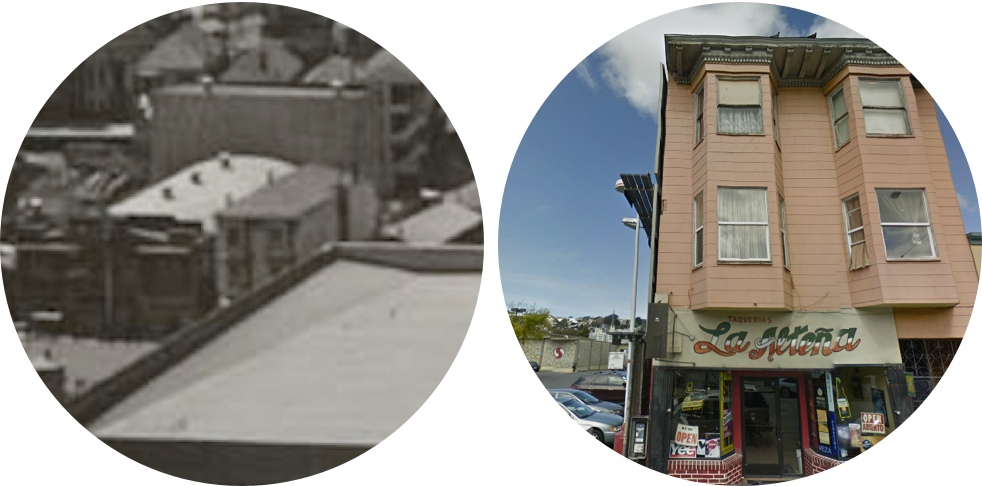
which once had a bowling alley!
And in 1910, the cops busted it for being open after hours:
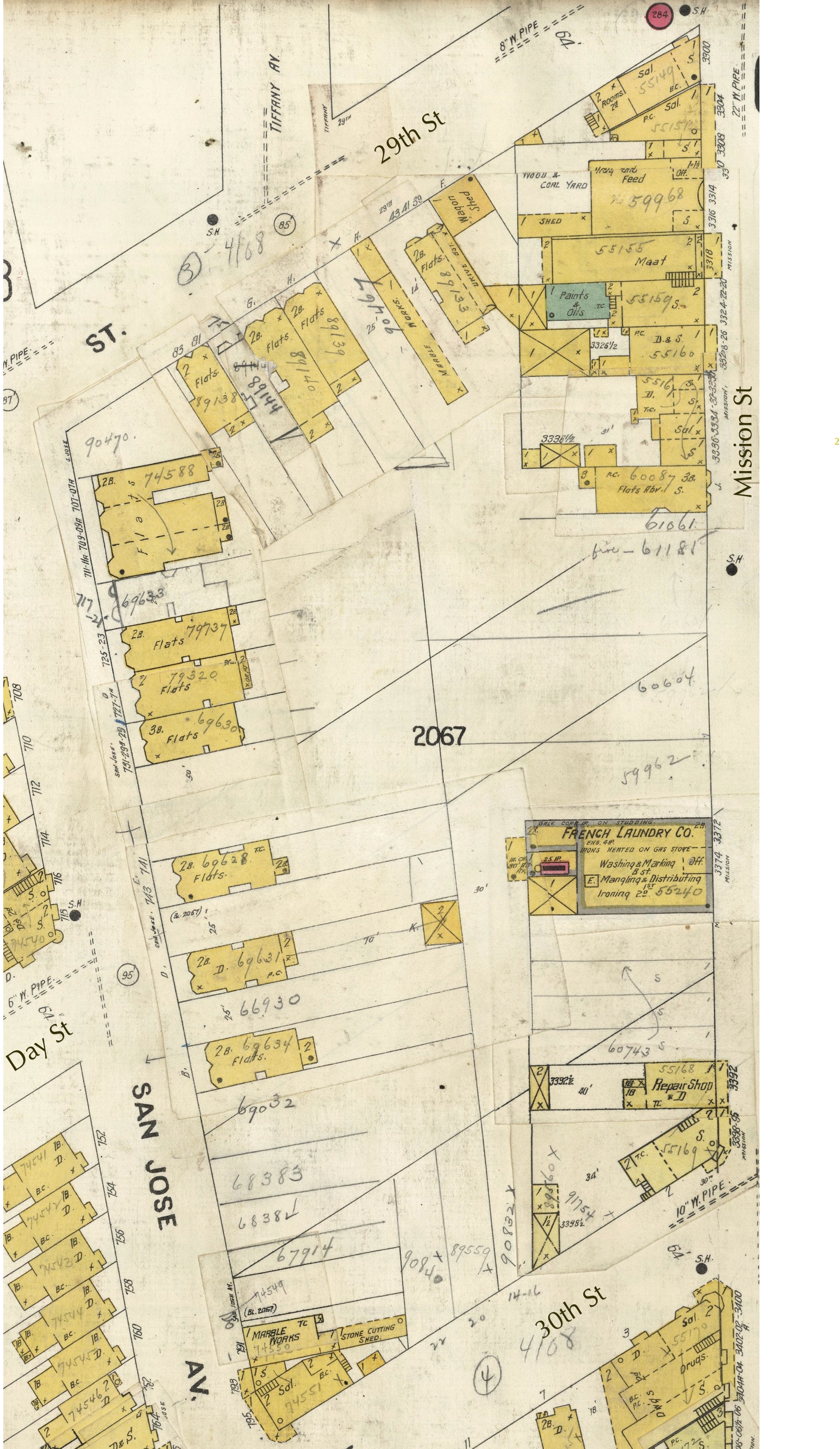
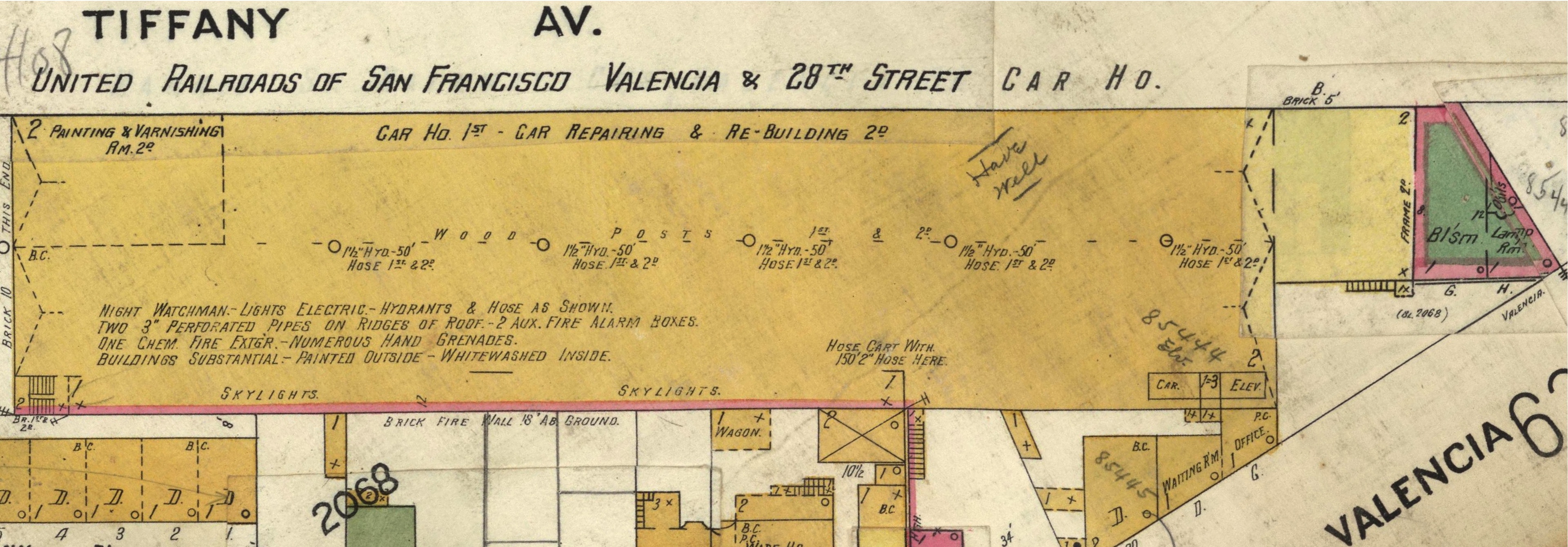
Half of the east side of Tiffany Ave was taken up by the United Railroad car barn (previously Market St. Railroad).
The buildings along the 3200 block of Mission Street that backed up onto the car barn are still standing:
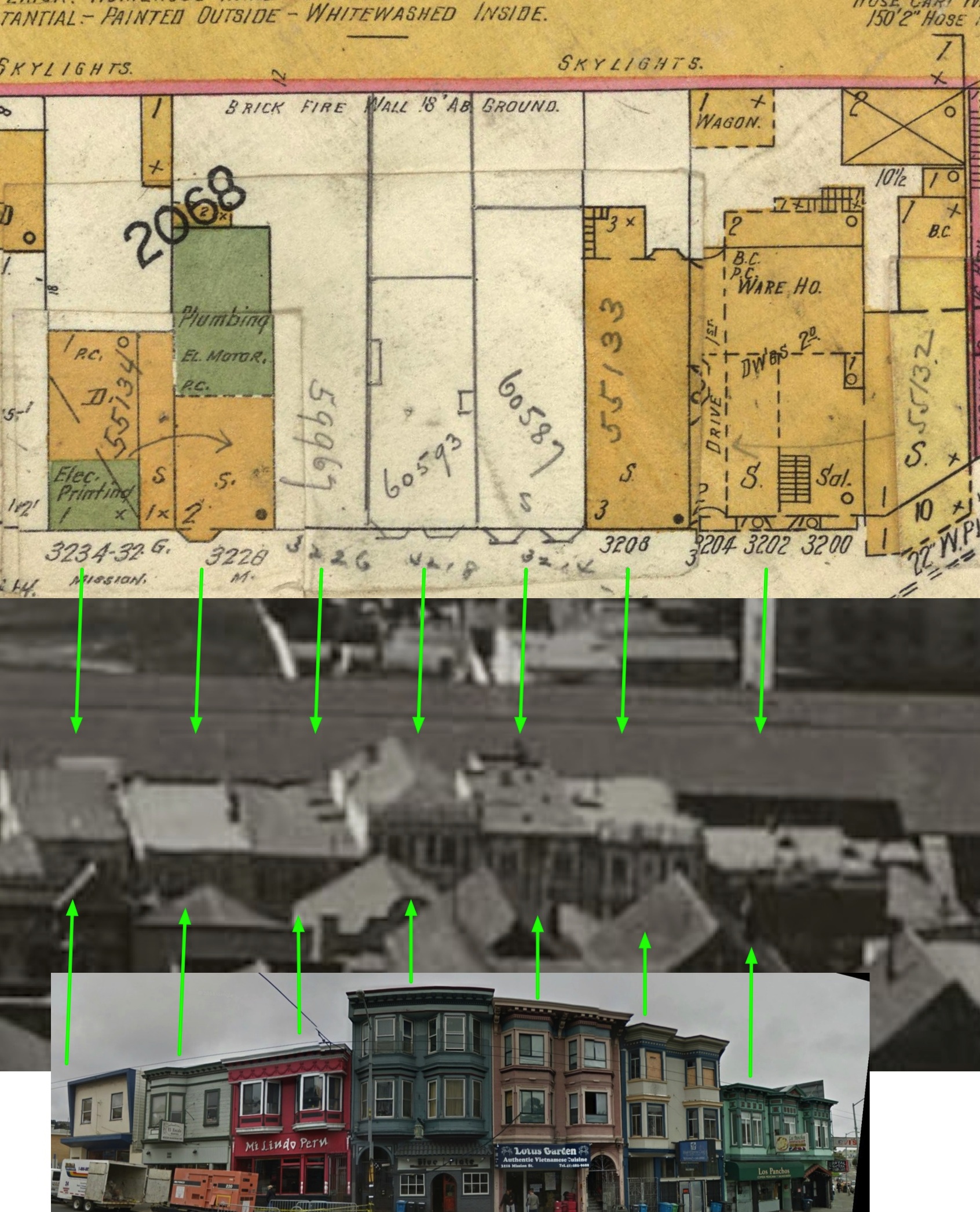
And the old wall of the car barn is what you see when you eat in the back of Blue Plate!
Here’s a picture of the car barn looking south up Tiffany, via Paul Trimble:
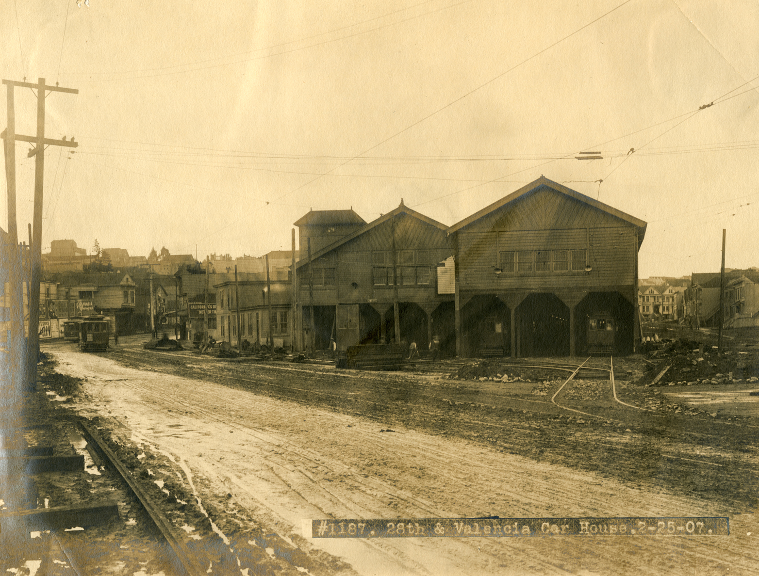
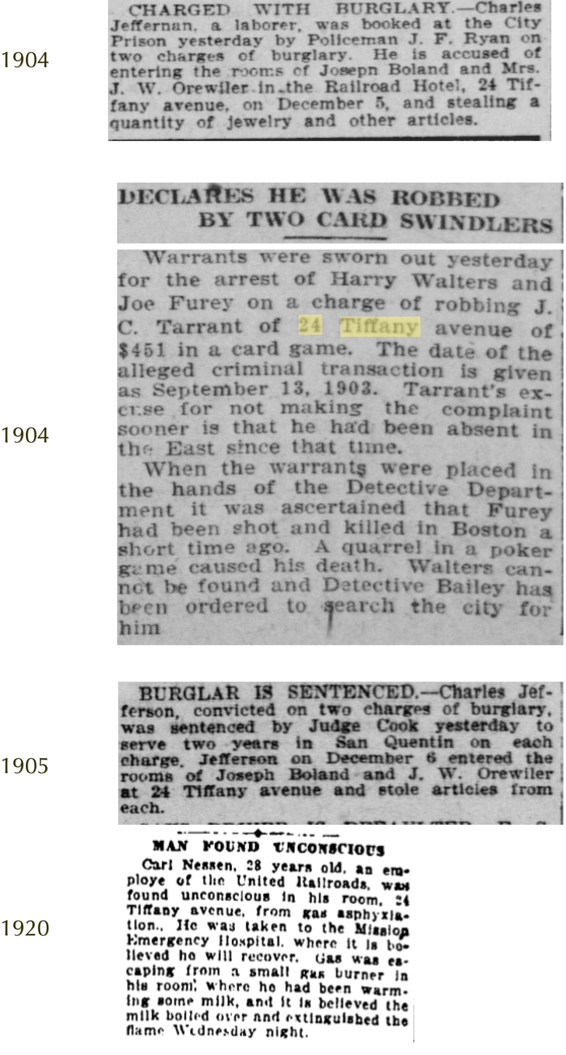
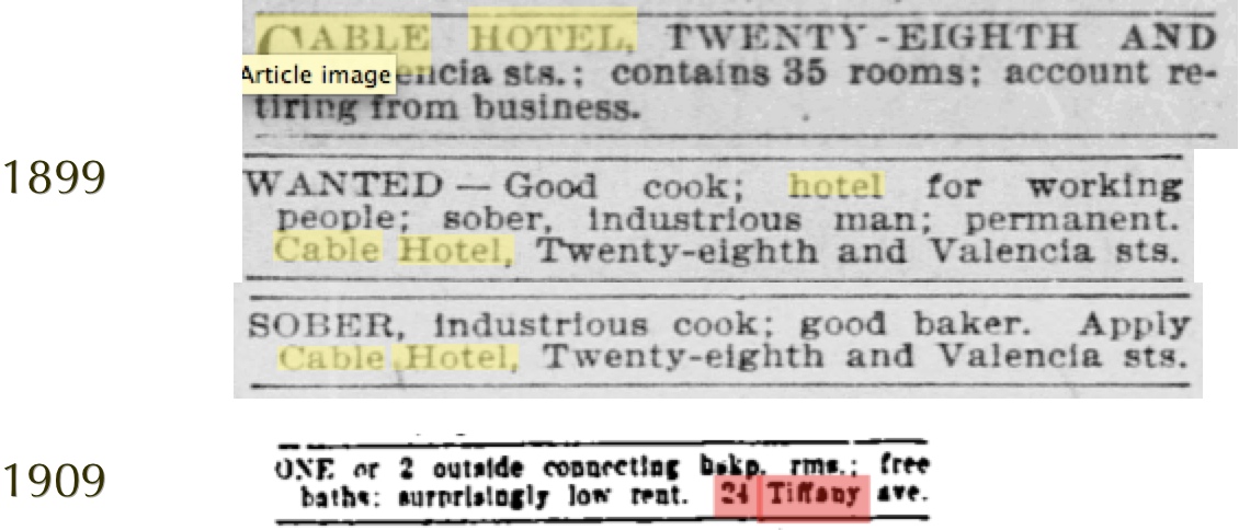
Across the street from the car barn was the “Railroad Hotel”, a 30 room boarding house. Built in the 1880s, it was once known as the “Cable House”, and was torn down in the 1920s.
Looking through the archives, all sorts of crazy-ass things happened at 24 Tiffany. Seriously, they could have made a reality TV show about it. If you ever time travel and stay at the Railroad Hotel, it’s best to not leave your things out:
Rather than merely passing out from gas, the “hard drinking” Hugh Lynch mistook his window for the door and fell to his death from the 3rd story of the Railroad Hotel in 1899:

In 1906 you could have caught Leah Kleschna stealing your things:

In 1894, bartender Thomas McCann shot himself in his room.
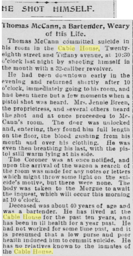
Up to 1890 he was an cable car conductor, so I’m sure there’s a story there.

In 1920, Cecil Wave Breck, the 15 year old daughter of residents of 24 Tiffany, ran away with a Canadian electrician to Chicago to become an actress.

(Anyone in Chicago want to look up George M. Forest?)
Unsurprisingly, the boarding house was looking for sober cooks and waitresses, and advertised “surprisingly low rent”.
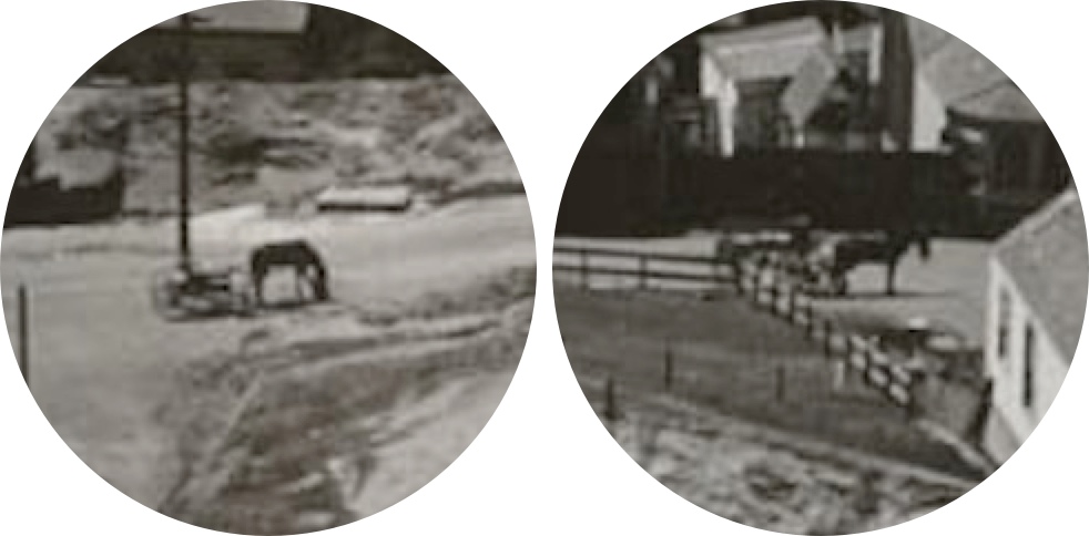
Anyway, let me know in the comments if you find anything else interesting in the photo, like these horses hanging out on the unpaved streets of Bernal Heights:
https://findery.com/burritojustice/notes/cable-house-railway-hotel
Rent from on High
Stephanie May, aka @mizmay, has generated a rather amazing zoomable heatmap of 1 BR rental prices in San Francisco.

I love (and agree with) her assessment that her map is”better than all the others that came out in the past two weeks”:
1. I used a dataset that spans a longer time range than one month, so that the sample sizes per neighborhood are larger. My data spans the second half of 2012.
2. I filtered for duplicates, so that the same apartment listed multiple times does not skew the data.
3. I used median instead of mean, which makes sense when you are dealing with a lot of outliers. You should be suspicious every time you see some shocking statistic about the “average rent” in San Francisco. The high end skews things quite a bit.
4. The fact that I am even explaining my methods and assumptions.
5. Instead of a silly choropleth, I made a super-pretty heat map based on the spatial variability of listing prices. The interpolation is based on ordinary kriging, and I underlay it with contours to bring out the variation a bit more.
Bolding by editor. Using median instead of mean makes for a much better map.
And even better, she created “violin plots” to show the rent distribution within each neighborhood.
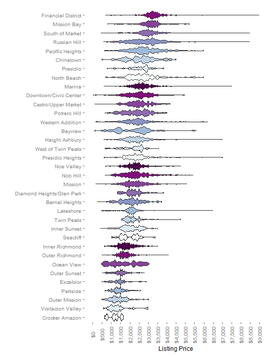
Here are the number of units per neighborhood (remember, this is across the second half of 2012):

The Mission and Bernal are still considerably cheaper than the foggy northlands. Here’s a zoom and enhance of some SESF neighbourhoods:

(Thanks, Stephanie for the better resolution images.)
I was initially surprised by the bimodal Bayview, but Stephanie points out that is due to new construction near Candlestick and Mission Bay.
A version of this for houses (per sq ft I guess?) would be interesting, as would playing (sorry) the violin plots over time. Anyway, hooray, Stephanie and TileMill and MapBox!
What’s Underneath Those Brick Circles?
I’ll just start out by saying HOLY CRAP, because this is what you’re going to say when you realize what I’m about to show you.
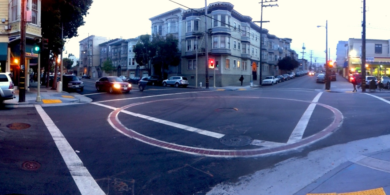
You’ve probably seen these:
 by Cole Valley Alley (defunct)
All the way round:
 by me
by meI’ve always felt that a rite of passage in becoming a San Franciscan is discovering the true nature of these brick-lined circles. Streetcar roundabouts? No. Helipads! Nope. Crop circles gone horribly awry? Not quite. Cooling infrastructure for the Burrito Railgun? The SF Emergency IPA Supply? You’re getting closer.
They are SFFD water cisterns. They’ve been around since the city was founded (maps!), but were massively upgraded after 1906 as a backup system in an effort to keep the city from burning down after the next earthquake.
But did you ever wonder how big they are? I did, in a half-assed kind of way while passing by them. THEY ARE BIGGER THAN YOU THOUGHT:
 by Robin Scheswohl/SFPUC
This photo, taken by Robin Scheswohl, is badass in a number of ways:
Scheswohl has worked for the San Francisco Public Utilities Commission for six years photographing pump stations and reservoirs. She says this cistern was built in 1910, following the 1906 earthquake, as part of a supplemental source of water for the fire department. Scheswohl notes that, like the worker who was engaged in seismic upgrade work in the image, she wore a hazmat suit, a harness and an air quality monitor as part of her equipment to get the shot. The monitor was used to detect the presence of hydrogen sulfide gas.
Everything you wanted to know about San Francisco’s firefighting water supply is in this thorough article. In addition to the meaning of the different colored fire hydrants and redundant reservoir systems, we learn:
The average capacity of a cistern is 75,000 gallons with the smallest being 9,600 gallons, located at Stockton and Vallejo Streets, and the largest being 243,000 gallons, located in front of City Hall at the Civic Center.
For reference, Wolfram Alpha says 75,000 gallons would make a sphere about 27′ in diameter, or a cube 22′ on a side, so this looks to be a typical cistern.
Needless to say, Robin’s photo is one of the 2012 Engineering News-Record Images of the year, a worthy publication of various large and epic things. Some more shots:
Working above the fog on the new span of the Bay Bridge:
 by Martin Chandrawinata
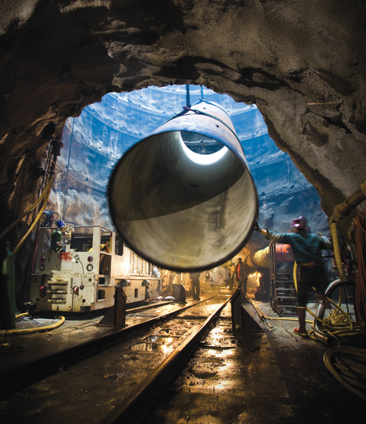
Some of the people digging the “New Irvington Tunnel“, an upgrade the water pipeline coming in from Hetch Hetchy.
 by Katherine Du Tiel/SFPUC
It goes under the hills between Sunol Valley and Fremont and is a pretty big tunnel:
(If only we could make 3.5 mile transit tunnels in San Francisco for $319 million.)
Speaking of tunnels, did you know there’s already a second Transbay Tube? It’s 15 feet tall! Alas this particular Bay Tunnel will carry Hetch Hetchy water between Menlo Park and Newark.
More details on it and the whole upgrade project here. Yes, it uses a Tunnel Boring Machine.
The new pipe will be installed in a dedicated tunnel constructed roughly 100 feet below the bay floor. Known simply as the “Bay Tunnel,” the new conduit is 15 feet in diameter and more than five miles long. The digging is done by an earth pressure balance tunnel-boring machine (TBM), a type of tunneling system well suited to the dense clays that make up much of the bay floor. To launch the TBM, the project’s tunnel contractor, Michels/Jay Dee/Coluccio Joint Venture (MJC) excavated a shaft 58 feet in diameter and 124 feet deep in East Menlo Park on the west side of San Francisco Bay.
They just finished boring the tunnel itself and are installing the pipeline bit by bit.
The pipe installation will begin from the Peninsula shaft lowering the pipe spools, placing them on a carrier connected to a railroad car and delivering them through the tunnel to the Newark Shaft where the first segment will be installed. The end of each pipe spool will be fit and welded to connect and secure each joint. The Contractor expects to complete installing the pipe liner in early fall 2013.
So basically there are trains running underneath the Bay between Menlo Park and Fremont.
Here’s a photo of a piece of pipe being is lowered into the Crystal Springs bypass tunnel. (Photo via SPUR’s sobering “Future-Proof Water” report.)
 by Katherine DuTiel/SFPUC
And this conclude’s today’s summary of underground water infrastructure in the San Francisco Bay Area.
(Thanks to @spenbald for pointing out Robin Scheswoh’s cistern photo.)
iPhone Moon
Hey, look! A picture of the full moon!
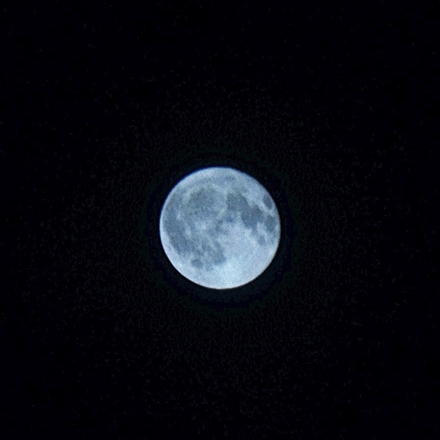
What’s special about this? Well, *I* took it, so there’s that. But I also took it with an iPhone.
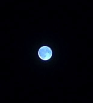
So those of you who have tried taking a picture of a bright moon know that you usually get a giant blob like this.
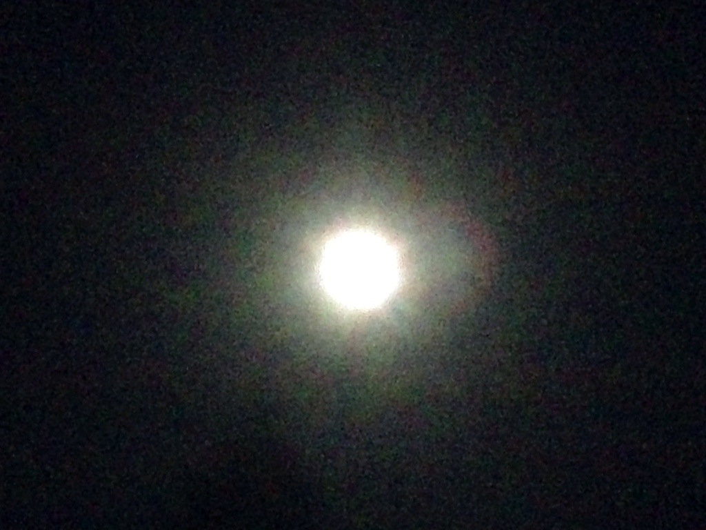
The iPhone can actually adjust the exposure quite well, but for some reason it can never lock onto the moon.
So here’s the trick: point at a lightbulb and tap/hold to lock the exposure. (UPDATE: some apps like CameraSharp and VSCOcam let you set the exposure and focus separately.)

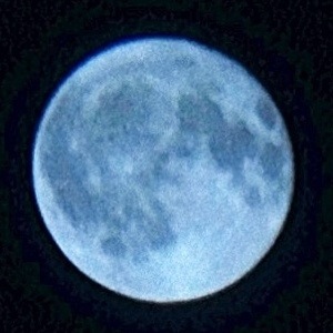
Then go point at the moon:
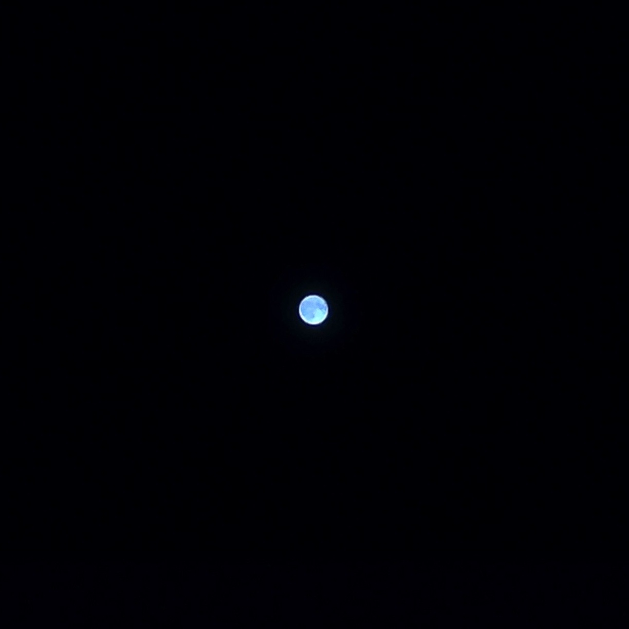
Zooming in, you’ll get a crisp but smudgy picture.
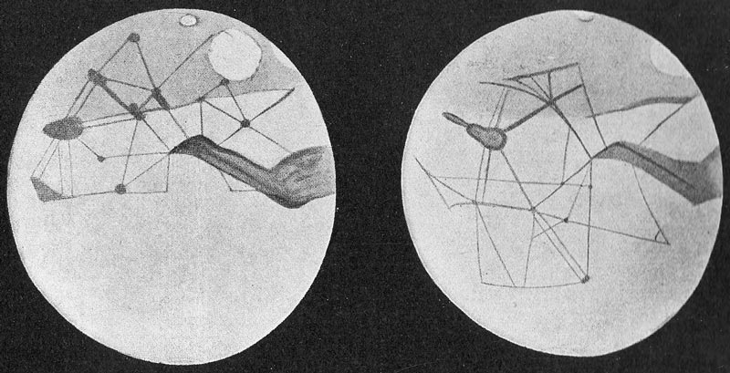
Reminiscent of Percival Lowell, though no canals:
To make it more crispy, I applied the witchcraft of the Photojojo telephoto lens, et voila:
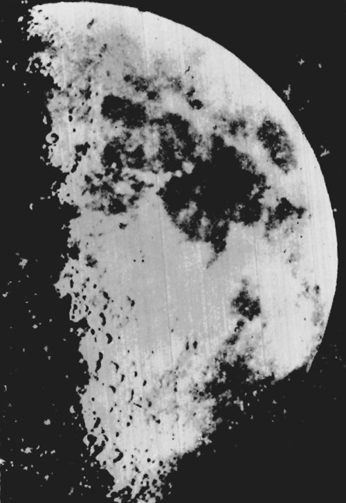
Of course, my photo pales in comparison to the first photos of the moon. This daguerrotype was taken in 1851 by John Adams Whipple in Boston.
Some sources say Daguerre himself made an image in 1839, but it was destroyed in a fire than consumed his lab that same year. John W. Draper made this daguerrotype in 1840 from NYC.
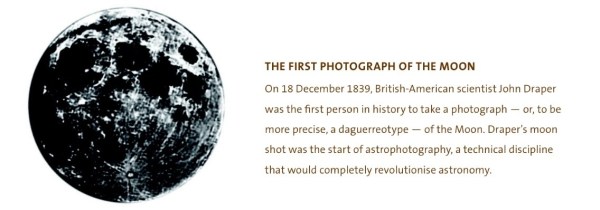
IMPORTANT HISTORO-UPDATE:
While Draper did indeed make a daguerrerotype of the moon in 1840, it seems that it too was lost in a fire. If so, I’m not entirely sure when or by whom the above photo was taken.
Let us all thank Samuel D. Humphrey for standing outside at 10:30PM on September 1, 1849 and screwing around with exposures from half a second to two minutes to make this gem:
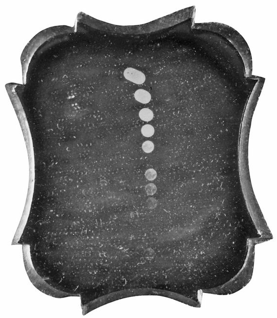
Of course, I look at this and think GIF1849a:
So here’s to you, Samuel — let us all drink an IPA in your honor.