In response to all the straight-liners out there, reductio ad absurdum:

Hey, you’re underground, so you don’t need to see the bay, right?
(By popular demand, black and white t-shirts are available on Zazzle. Why in the hell are black t-shirts so expensive? Any other more reasonably priced vendors out there?)
For the record, I like most of what BART did on their new map, just not the part in SF. I’m all for straightening out wiggles, but the curves of the Mission are important.
Geofftech.co.uk has an excellent archive of alternate takes on the iconic London Tube map.
The literal version:

vs the same area optimized:
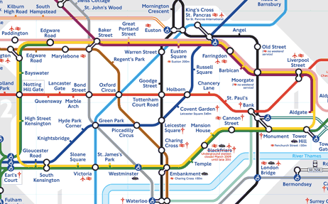
This is obviously better, but note that many ‘curves of significance’ are preserved — St. Paul’s, Regents Park, Covent Garden, Oxford Circus, Piccadilly Circus…
There are tradeoffs however, as highlighted in this surprising map made by RodCorp — the dotted lines connect stations that are less than a third of a mile apart (where it would be quicker to walk than ride):
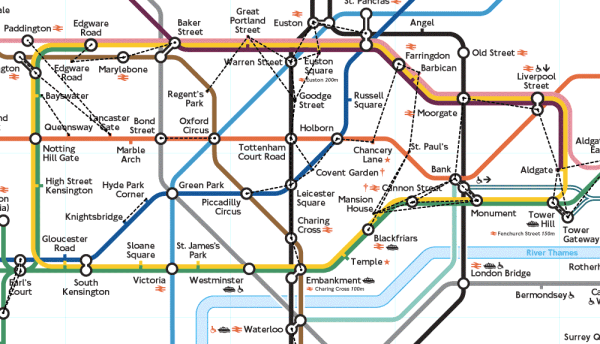
(If only we had such a dense network of metro lines to have to worry about such things.)
One last argument — Baker St to Waterloo is about the same distance as Powell to 24th. Two maps, same scale:
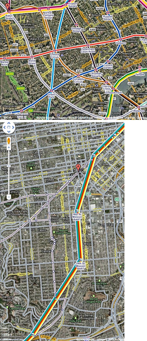
And here is how each transit map depict(ed) the curves along these routes of roughly the same distance:

UPDATE: More relative map comparisons in this exciting post.


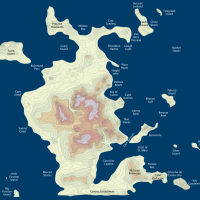




Can I get that on a t-shirt?
Bravo! I’d like the first image on a t-shirt too!
Now you’ve made me wish I was going back to London soon. :(
Ok, so at first I thought you were being silly about the Mission curve. Downright fanatacist even. But after this post, I’m thinking I miss it too. Touché, mes frères. Touché.
By popular demand, black and white t-shirts are available on Zazzle. (Through Sunday use the code PIRATEDAYTEE for $3 off. And why the hell are black t-shirts so expensive? Any other more reasonably priced vendors out there?)
Order placed, thanks juanito
I LOVE the reductio ad absurdum version. Just fix the Castro Valley error and this is brilliant.
@DaveO, do you think I should nudge Castro Valley to the right a little bit?
Nice hyper-straightened version. BTW, there was a time when humankind actually hadn’t developed the idea of an abstracted, simplified metro map and the maps of the London Underground were so realistic and respectful of actual geography that they were basically nonfunctional. The first abstracted/simplified map was an unsolicited proposal that a draftsman named Henry Beck drew in 1933, who hand-lettered thousands of letters in the London Underground typeface in the process. It’s interesting, as you point out, that the process of abstraction can reach a point of diminished returns when it erases something as recognizable as the curve in the Mission or the Bay.
I love this quote from a Guardian article a few years back.
“No, it’s definitely not a map. A map is geographic. This is a diagram.” Beck would have averred. The engineering draughtsman of Finchley referred to his creation as the “London Underground diagram”.
Also, “Mr Beck’s Underground Map” by Ken Garland is supposed to be a good book.
Aha! Thanks for the Ken Garland recommendation. Will definitely check it out. That is indeed a great quote from Beck.
So the London transit managers removed the Thames from the Tube map. The mayor was unamused and had them put it back.
http://www.telegraph.co.uk/travel/travelnews/6201988/River-Thames-restored-to-London-Tube-map-by-Boris-Johnson.html
(I somehow don’t think Gavin will get involved here.)
I liked your point, but was distracted by not being to find Baker and waterloo, expecting them to be in the same orientation as the powell -> 24th. Circling , arrows / highlights would have made it easier to understand your point, with some scale to make your point for especially pedantic individuals.
Did you see the followup article with this map breakout? Little point doing the optimized map — BART would be a 7 mile long straight line with even spacing between stations. Map FAIL.
I love this design. T-shirt available but no poster or high quality prints? I would love to have this as a print to hang. Thanks.
Good idea. I assume the dark background? Black or some other color (dark blue, etc)?
HI Johnny,
I like it on the white background. I’ll be the first one to purchase this. Thanks.
Graham
Hi Johnny,
I just got my posters today. They look awesome, thanks for making them available.
Graham
Glad you liked it! Thanks for the idea.