Rare Hectic Energy vs Slavish Geometric Inaccuracy
Quick! What’s this?

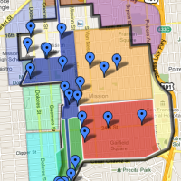
Is it a contour map of Bernal’s western slope? Perhaps a chart of KevMo’s popularity over time?
Here’s a hint. And the color is important too.

Bigger hint:

Before you run to the London Tube maps you have pinned to your wall, let me save you the trouble — it’s the Bakerloo Line between Baker Street (on top) and Waterloo (bottom). Oxford and Picadilly Circus(es) are in the middle.
 I bring this up as my distaste for the new overly-straight BART map was recently referenced in an article by Design Observer (the traffic from which leads me to believe it’s a substantial website read by real designers as opposed to my pedantically hacktackular self).
While I readily agree the previous wiggly BART map sucked, and that the new map has certain improvements, my main criticism was over the elimination of the Mission curve. The standard response was “London Tube map!” which I adore, but it’s simply not a valid justification for the new map. And why, yes, I will show you with pictures. (I’ve been meaning to draw up better diagrams contrasting the London Tube and SF BART maps, so here we go.)
Consider these extracts, to scale, of the literal Bakerloo tunnel on the left and the BART tunnel between Embarcadero and Glen Park on the right. (I’ve rotated the Bakerloo line a bit to better compare the relative lengths.)

The distance between Baker (top) and Waterloo (bottom) is roughly the same as that between Embarcadero (top) and 24th. Same distance, one more station, one more curve. How does the London map handle it? No straight line, that’s for sure, as we see in the brown line below:

Side by side comparison of literal vs diagram:

(Geofftech.co.uk hosts many alternate takes on maps of the London Underground, including several showing the entire literal system.)
BART, however, takes the brute force approach and straight-lines it from Embarcadero — blowing out not just the Mission curve but the Bernal curve as well — with one straight shot to Daly City, and even spacing between stations. There’s not much point showing it as an extract.
Then there’s the ridiculously detailed coastline and the airport in the middle of the peninsula, but now we are being unfair. As a commenter Neil noted on the Design Observer article, the new map is “strangely half-assed.” I suppose the intent was noble but the end result is disappointing.
As the Rachel Berger of the Design Observer article concludes,
Ultimately, how a transit map looks communicates information about the people who designed it, the people for whom it was designed, and the place it represents. Certain transit maps have come to symbolize the very spirit and character of a place. In Metro Maps of the World, author Mark Ovenden claims it “difficult to imagine an image more ingrained into the very psyche of a population” than the London Underground map. Ovenden also maligns the “slavish topographic accuracy” of the old BART map. Yet loyalty to topography is what gave the old map its unique visual qualities. Besides, the new BART map engages slavish geometric inaccuracy. The BART system, with five lines and forty-three stations, is simple. The new map feels inauthentic. Lines have been straightened for straightness’s sake, not to solve design problems. The BART map gained legibility but lost a rare hectic energy. Now that the old map is nearly gone, I realize how wonderful it has been to be confronted by a poetic, painterly map, by a map that makes me uncomfortable.
So what’s the answer? While do I rather enjoy wearing my reductio ad absurdum BART map t-shirt…

…in terms of practicality and aesthetics, I once again call for BART to adopt the awesome transit map designed by SF Cityscape. I beg of you, do riders a favor. Otherwise I’m slapping the damn things up in stations myself.

(Meanwhile, some perspective is in order. Here I am fucking complaining about a map I don’t like when there’s this to rebuild. In addition to whatever you give to the Doctors Without Borders or Partners in Health for Haiti, Design Observer also suggests donating to Architects for Humanity to help with strong reconstruction.)


Fantastic article. I didn’t fully get the passion behind preserving the Mission curve until reading your previous article. I’d always taken the side of objective modernism in the past. Regrettably, that attitude tends to run roughshod over history, as shown by your article on SOMA sand dunes.
I loved the link to the map by SF Cityscape. Finally a useful rail map of the bayarea!
I totally agree the new map is reduced beyond recognition. that reductio ad absurdum tee is hilarious. A similar debate happened in NYC back in the 70s when the Italian designer Massimo Vignelli “straightened” it out… but curves won in the end.
I think the problem with maps like this… is that they make absolutely no attempt to synchronize with local street maps or landmarks- so you have to translate onto another map or 2 or 3, or just guess where you’re going to end up. It’s total navigatus ridiculum, not to mention touristus confusius. Unintuitive and impractical.
Hi there, its nice paragraph concerning media print, we all be aware of media is a impressive source of information., http://goo.gl/II0hFN