The Flags of San Francisco
Hey, did you know San Francisco has a flag?!? (I mean, other than the Castro flag.)
Lots of history behind this — the very wooden early San Francisco burned down many times:
1849: Dec 24
1850: May 4
1850: Jun 14
1850: Sep 17
1851: May 3
1851: Jun 22
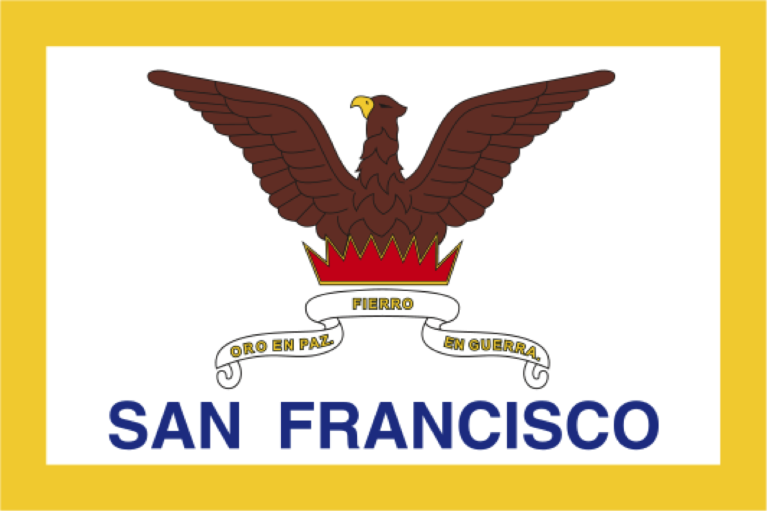
While I love the IDEA of our flag, I don’t actually LOVE our flag. It’s kind of… meh, to be honest. And apparently I am not the only one. The all-powerful and knowledgeable Roman Mars noted the same when he moved to Chicago from SF. (A worthy podcast.)
So when I moved back to San Francisco in 2008, I researched its flag because I’d never seen it before in the previous eight years that I’d lived here. And I found it … I’m sorry to say, sadly lacking.
He even interviewed a vexillologicist, Ted Kaye, on what makes a good flag.
No lettering or seals. Never use writing of any kind. If you need to write the name of what you’re representing on your flag, your symbolism has failed.
So San Francisco obviously is mocked in vexillologicist parties, though we are in good company as they also think the text on the California flag is ridiculous.
At this point in this post, it should be obvious that I am going to propose a few alternate designs for the San Francisco flag. However, before we get to my modest proposals, I think it is important to review prior art. The most prominent of these was commissioned by the Bold Italic, defender of irony. (I suggest some sort of protective eyewear before your read any further.)
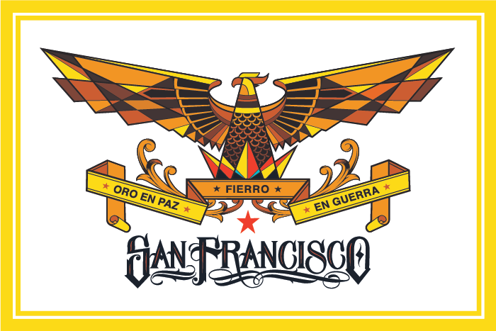
OMG accident at the stained glass factory! Or perhaps the Anchor Steam and Prohibition bottling plants collided?
One obvious alternative would be a Sutro-themed flag:
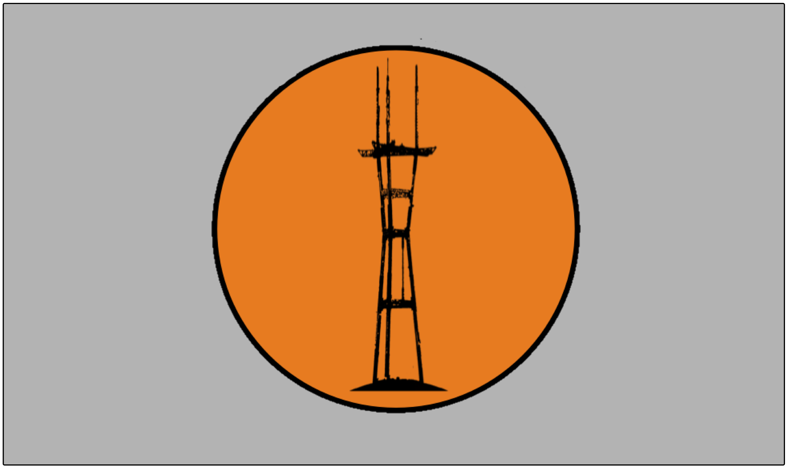
It even comes with its own anthem!
Anyway, one big update you could make would be the logo. Iron and gold and fire is great, but let’s bring it into modern times.
Ted Kaye and Roman Mars and I are in agreement about one thing — the gold border is cool. And the phoenix is awesome. But just not THIS phoenix. (Or the phoenitalix…)
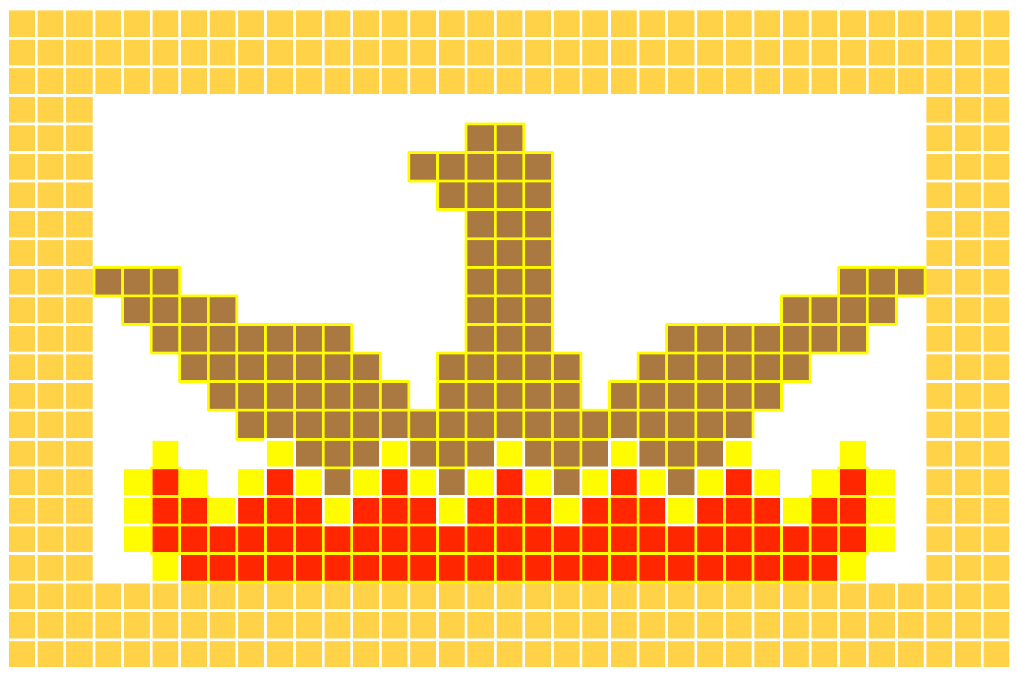
Behold my modest proposal, using vexillological principles:

Yeah, a kid could TOTALLY draw this.
I’m not sure how I feel about the brown. (What color were phoenixes anyway?) So here’s a version with more red.

Of course, this being the internet…
https://twitter.com/Lahlahlindsey/status/367749237238661120
FINE LINDSEY
Now I just need to trick someone into making this into a GIF and we’d be all set for the next 164 years.


Squinted at the 8-bit for a few minutes and had lie down for a while.
Just imagine the GIF!
Consider using the SF NERT phoenix symbol. More modern.
Sadly my Photoshop skills are lacking so I cannot figure out how to place it in the SF flag or your updated flag.

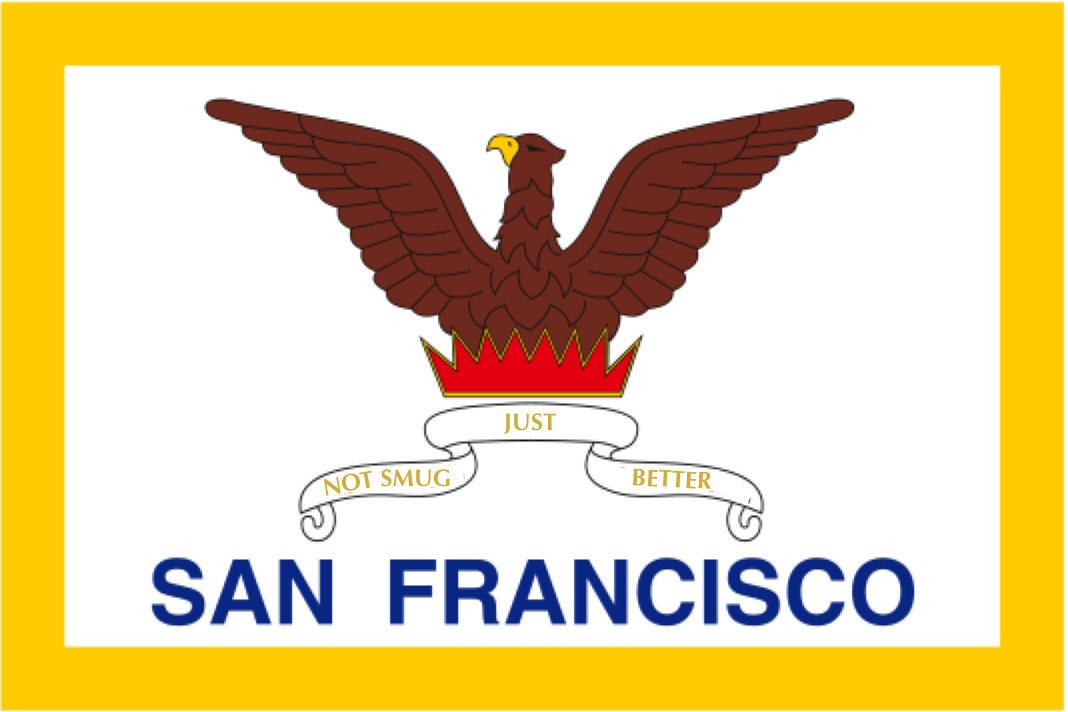
I like the one with the “Not Smug, Just Better” slogan! The others with similar design could just as easily be in Phoenix.
Forget the fire. A pair of levis would do nicely.
Sutro flag FTW!!!
Chicago’s Flag Kicks Ass!
http://en.wikipedia.org/wiki/Flag_of_Chicago
Two Rivers, an Indian Massacre, a City-wide Fire, and Two World’s Fairs!!!!
Obviously we need to just get a picture of a live phoenix emerging from a fire and use that. Or a gif of it. And holograms in there somehow on the flags.
My favorite local-ish flag is the one from the Bear Flag Revolt with its pig-like bear.
Why wouldn’t the flag be nautical? This place was founded on sea crafts and trade. Eagles always remind me of nazi’s.
Lol at the transplants trying to come up with SF flags.
Wait, are you Ohlone?
And talk to the vexillologists, not me.
Inspired by you guys and 99% invisible, I made a different attempt: http://sensemaya.org/a-new-flag-for-san-francisco/
The funniest thing about the SF flag is that the “San Francisco” is set in Helvetica.
Reblogged this on Portland Flag Association.
Here is my design (mentioned in Roman Mars’ TED talk) http://neilmussett.deviantart.com/gallery/