San Franthropomorphism 2012 Calendar
Anthropomorphic Twitter accounts are increasingly common. San Francisco is particularly rich with these accounts — @SFBayBridge, @SutroTVtower, @TransamericaBdg and @555CaliforniaSt are but a few, and all have taken on distinct personalities.
@seismogenic, a real human being, is a geologist who would rather be in San Francisco but is trapped for the time being in Southern California, and wants to make a Kickstarter-funded San Franthropomorphism 2012 calendar:
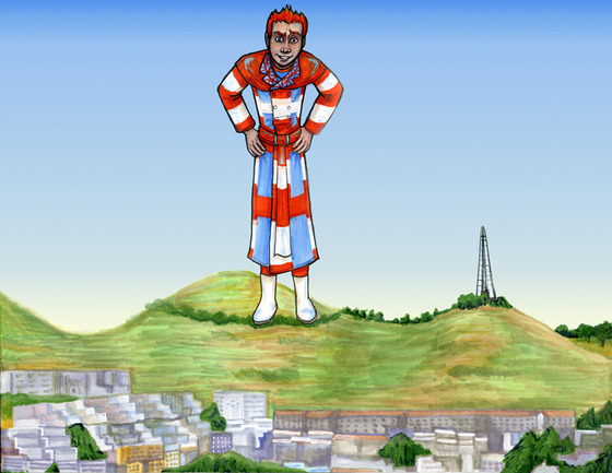
The gist of this project is San Francisco and anthropomorphism. These are my interpretations of what many of San Francisco’s major landmarks would look like (and act like) if they were humans. Anthropomorphism as an artistic and literary device goes waaay back, so why not extend it to some of the structures and icons whose personalities contribute so much to the character of the larger City?
More on the calendar itself:
It’s a 2012 calendar featuring drawings of personified landmarks in their setting within the cityscape. It’s kind of a send-up of those calendars of pretty pictures of famous landmarks that you see in every gift shop in any city: that kind of scenery, but replacing the actual landmark with a human character based on that landmark. Since this is a San Francisco calendar specifically, in addition to including all the standard US holidays, it will also have key dates in the City’s history included in the day grid itself.
The final print size will be 8.5×11 inch pages – 11×17 once it’s unfolded. The prints will be in full color on glossy paper, with a glossy cardstock cover. They’ll be bound with a staple and have a hole punched in the top for ease in hanging. They will not be individually shrink-wrapped, because that’s not green at all, and this is San Francisco.
If you find this kind of thing appealing, as I obviously do, jump over and help fund the project by October 17th. (We’re already 1/6th of the way there!)


Cool illustrations but c’mon, did Alcatraz really have to be Black…?
My comment was just about to be, “My favorite part is how the only discernable person of color is the prisoner. And by ‘favorite’ I mean ‘good grief.’ :( “
Alcatraz is not meant to be black. He’s meant to be the color of the rocks on the island. That’s also why his hair is green: trying to match the landscape.
With all of the personifications I draw, I base their colors on the color of the structure/rock/paint/etc. I sincerely apologize for causing misinterpretations like this; I feel like a total jerk.
Er…correct me if I’m wrong, but isn’t he basically the same skin tone as the Ferry Building character in this image?
I have added a long description of how I develop these character designs to the project FAQ. I hope this clears up any misconceptions the project screenshot might have presented.
(Long story short: all of the character designs are based primarily on the architectural/geological shapes of the landmarks and on the colors of the material/paint/rock they’re made of.)