The World According to Flickr
Quick, what’s this? Ants?!? It had better not be ants. Fuck do I hate ants.

Hmm, this is looking more familiar (hint: tilt your head).

Another hint (if you don’t get this one, you’re out):

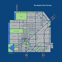
If you are guessing “Eric Fischer” and “Flickr” you are correct! They are from a world map made from geotagged photos. (Maps above are the American west (Sierras to Rockies), the west coast of North America, and the UK to Italy).

The darkest pixels are where a geotagged picture was posted in May, 2004, the oldest data I have, and get lighter and lighter by month for places where the oldest available picture is more and more recent. The areas that are totally white have no geotagged pictures at all.
Eric once again delivers a unique and practical algorithmic approach, shading the data by age — otherwise the map would be a dark, swarming mass (and entirely too ant like).


First!
I am having trouble keeping up with Eric but I have just put together a little tool for working with some of the data he is using to great effect.
You can get the overview here: http://sfgeo.dyndns.org:5000/
You can see for example a 10 minute walking radius around Dolores Park here: http://sfgeo.dyndns.org:5000/geofish/-122.427177,37.760062/3/800
ie: geofish/lon,lat of center pt./box-width-in-km/pixels-to-scale-to
This is fed by an api that you can also pull directly from — right now just pixels and dimensions but tomorrow json and geojson, and probably some examples of how not to write javascript. I have a canvas demo up but I would really like to do easy and meaningful SVGs as soon as I figure them out. The idea is to enable a lot more interesting queries, something interactive. Doubtlessly much less useful than properly using the flickr api, but who has time to learn that?
Nice! (And no one can keep up with Eric. He is of infinite speed.)
Will there be an API to make an index? How is that defined?
I just updated some of the queries to produce cleaner visualizations.
The index should be pretty fast for all geospatial queries on the Atlas data set. You should only have to do it once per table (it’s a vanilla Postgres GiST), and this table includes the first 100 atlas cities. So for example:
http://sfgeo.dyndns.org:5000/geofish/-87.610989,41.891544/5/500
is a 500 pixel detail of a 5 km box around Navy Pier in Chicago. You can go to a site like this: http://www.gorissen.info/Pierre/maps/googleMapLocationv3.php , get a lon lat value, and plug it into that url, edit the last two parameters for the size of the geography to map, and lastly the size of the canvas you want back.
What we could have more of is WKT queries. So for example the _api/atlas values are derived from a query like this:
‘atlas’:”select st_asgeojson(the_geom_ls) from atlas where ST_Contains(\
st_geomfromtext(‘POLYGON((%s %s, %s %s,\
%s %s, %s %s, %s %s))’, 4326), the_geom_ls)\
and time_delta < 300 limit 10000"
those "%s" parameters just are a box generated by parsing the url (now its a square but it would be easy to do a rectangle or circle.) "the_geom_ls" is a linestring geometry representing the movement of photographers as in Eric's first visualizations. If anybody thinks of points or shapes or whatever other kind of geometries might be inferred from the first set of data (time, location, unique user id, speed), I would love to add queries.
If you want to just use points like the visualizations in this post, for the Chicago Pier example you would go to:
http://sfgeo.dyndns.org:5000/_api/atlas/-87.610989,41.891544/5/500
That gives you just a bunch of values like this:
"lon1 \t lat1 \t lon2 \t lat2 \n"
— which are transscaled from lon lat into pixels. You can parse that in javascript and draw to an svg or canvas element as dots, circles, curved lines, etc. I will put something up tonight that returns plain json (although flickr is probably better at that!) When I first took a crack at this a few days ago I started with a sequential thing in javascript so you could continuously draw a surface live and that is what I still want to do but it is way beyond me to do it without murdering my browser (all my ambitious javascript is sub-terrible and invariably freezes even Chrome.)
Actually I think I am going to try a global-scale one tonight in keeping with the 4 steps behind Eric game (and it's only 4 steps because he is pulling our skateboard as he runs.)
Indexes are finished building and those examples are getting usable.
Johnny0 —
I think I may have just had a long comment spamtrapped for dozens of links to dynamic ip addresses on unconventional ports including some raw SQL — why on earth would that happen? If it shows up disregard this but big picture the index should work for all the atlas data sets; they are in a single table and it is a plain Postgres GiST index.
so for example:
http://sfgeo.dyndns.org:5000/geofish/-87.610989,41.891544/5/500
is a 500 px area around Navy Pier in Chicago centered at -87 lon 41 lat representing a geography of width 5 km. If you just want the lon lat transscaled to pixels for svg or other javascripty apis you can call:
http://sfgeo.dyndns.org:5000/_api/atlas/-87.610989,41.891544/5/500
I want to do a global scale thing tonight, always a few steps and a million years behind Eric, mostly because he is pulling us along with him.
Also anyone can contribute any Open Geospatial query you can imagine and it will be instantly transmogrified into an url, the syntax for the _api/atlas queries is just:
‘atlas’:”select st_asgeojson(the_geom_ls) from atlas where ST_Contains(\
st_geomfromtext(‘POLYGON((%s %s, %s %s,\
%s %s, %s %s, %s %s))’, 4326), the_geom_ls)\
and time_delta < 300 limit 10000"
Ha, you persevered. WordPress gets freaky starting with 3 links.
Now available in not-ants:
In the mission:
http://sfgeo.dyndns.org:5000/not-ants/-122.427177,37.760062/3/700
In SF/East Bay in general:
http://sfgeo.dyndns.org:5000/not-ants/-122.427177,37.760062/30/900
Non-ants near the Bank of England by the Thames:
http://sfgeo.dyndns.org:5000/not-ants/-0.102997,51.509597/5/700
It is a miracle wordpress has not banned me for life with the quantity of dubious links I am putting up. If you take a wider angle the view defaults to smaller points for photos so if you replace the 3 in the first one with 30 you get a finer-grained image of the whole bay area.
Thanks for making these visualization tools! I wonder what that flurry of activity is on Valencia just north of the corner of 19th Street.
I have no idea!
Here is a 500 yard box around that point and it is a real phenomenon:
http://sfgeo.dyndns.org:5000/not-ants/-122.421513,37.760808/.5/700
Maybe people taking pictures of what appliances to buy at Cherin’s?
I want to set up some queries to deliver hours-of-the-day relevant information; have you tried anything like that?
Also feel free to fiddle with, add, run applications or databases from other ports on that sfgeo server etc; it is the same one you have access to for serving the files.
I haven’t tried anything with times of day basically just because I don’t trust people to set the clocks on their cameras correctly — I’ve seen way too many pictures dated 12 hours in the future or 12 hours in the past or some other unpredictable offset from reality. (I trust the intervals between times on the same camera, though, because people whose clocks are wrong probably aren’t resetting the clock.)
But maybe I am too distrustful. Pictures taken with phones should generally have accurate times, since the network really knows what time it is, at least approximately.
The cluster on Valencia just north of 19th turns out to be from a long series named “Amit’s bike took a picture!”, most of which it apparently took while it was locked up outside New College or across the street. One of the many: http://www.flickr.com/photos/amits_bike/3501707623/in/photostream/
Damn, this is impressive! (Once I realized this only works for Eric’s 100 atlas cities.)
I’m still wrapping my head around the processing syntax. Any chance you could push the area around 48.8739892,-123.2899200? (That’s the path ferries take between Victoria and Vancouver.)
I just added everything for Victoria that Eric uploaded, this view:
http://sfgeo.dyndns.org:5000/not-ants/-123.2899200,48.8739892/100/800
shows some city in the north and some in the south over a 100km distance (it kind of looks like nothing with 2 cities at either end. I am not seeing tons of boats but maybe there is a way to find them. This one:
http://sfgeo.dyndns.org:5000/geofish/-123.2899200,48.8739892/100/800
shows some movement across the water. I am trying to create some queries that will show larger scale movement better — actually there should be a way to show movement between atlas cities pretty well; will leave a comment when that is up.
I actually am rendering the processing files with an html templating language (python jinja), I think the punishment for that is several extra days in purgatory. The syntax of processing itself is designed to be a simplified java. You can download an outstanding interactive ide for processing from processing.org and you can load web resources for your visualizations directly. So for example you create a variable something like… (will post and recomment to avoid link limit)
Bingo: If you zoom in:
http://sfgeo.dyndns.org:5000/not-ants/-123.2899200,48.8739892/45/800
http://sfgeo.dyndns.org:5000/geofish/-123.2899200,48.8739892/45/800
the funky curve most easily seen on non-ants is Active Pass.
You can clearly make out the ferry terminal on the north end. (The second line above it is the coaling terminal which I didn’t even know you could get to.)
Thank you.
And 5km zoom:
http://sfgeo.dyndns.org:5000/not-ants/-123.33,48.86/5/800
http://sfgeo.dyndns.org:5000/geofish/-123.33,48.86/5/800
Any way to control drawing speed? Might be fun to slow it down a bit based on relative time and distance between shots.
The drawing speed is the frameRate variable in the view*.pjs file. Something like 10 might be a good experiment. I will add a way to toggle that via the web but if you want you can go for example to
http://sfgeo.dyndns.org:5000/_api_pjs/points/-123.29,48.8739892/45/800/points_view.pjs
That is a processing script which you can copy and paste into the Processing program (I think it is called pde, wouldn’t be my first choice of name for a programming language though). Change the “loadFile” parameter to add sfgeo.dyndns.org:5000 before the relative path of /_api/etc. Or save the output of that query to a text file and load that.
That bit of Canada looks insanely pretty btw
Should have said “loadStrings” parameter. also you would need an “http://” before the sfgeo.dyn… bit (I think.)
lines = loadStrings(“http://sfgeo.dyndns.org:5000/_api/atlas/-123.2899200,48.8739892/100/800”)
and that will load the above data into your desktop application, which you can then export to quicktime, all kinds of things. You could also make every point a picture of a moustache or whatever and make a video of that. If you have something you like you can then deploy that as an html5 canvas with a couple of lines of code via processing.js. I have tried to do a number of things in javascript and am not great at it, if you prefer javascript I can refresh this original function I had that looked something like sfgeo.etc/_api/some_parameters/400/500, which would get you the records between 4 and 5 hundred, and then you could loop over that in javascript and continuously add to the canvas. The idea there is to use something like nextbus or recent flickr pictures in a given vicinity, pull the data live, and then put it on a live map. I am going to continue working on that and any ideas are welcome.