Pastel Poll
January 7, 2010
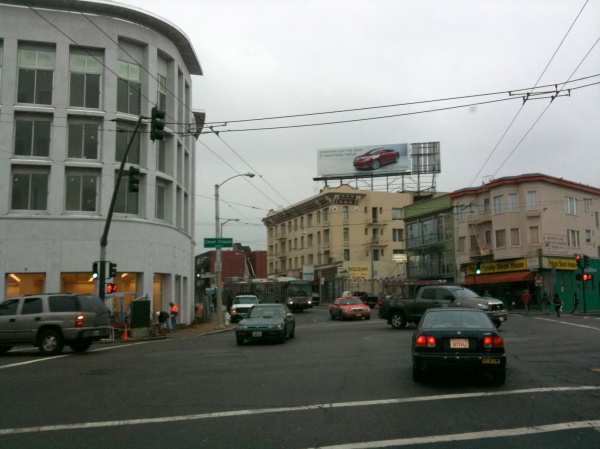
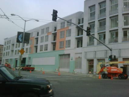
Mission Mission and Sexpigeon alert us to the Cesar Chavez Walgreens Color Controversy:
Do you like white?
Or pastels?
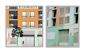
For those saying it’s a primer — perhaps, but here’s the plan from the website:
and this comparison makes me think there’s little difference pre- and post-prime.
Please take this color coordinated poll:
Editorial bias — I say keep it a crisp, cool white (even if Sexpigeon’s shots show just the primers for the color scheme on the elevation drawing).
11 Comments
leave one →





So far it looks f’ing terrible
It’s called primer.
I was just thinking that I hope they don’t paint it to look like all of the other ugly buildings on that corner.
Look at the diagram (where you can see the mural) – that’s not primer, same basic colors. Whatever they are, white looks way better.
That mural looks like King Sunny Ade leading the red Pac-Man ghost around on a leash.
Ahh, I thought it was the Kool-Aid Man. Oh yeah.
I really liked the white. The mural is fine and all, but those lameass Miami Vice pastels are all bad ’80’s memories for me. Yuck.
Hey, I have an idea — paint it green, yellow and ochre in homage to the Palace Steak House across the street (second to last photo).
call me jaded, but i don’t know that any color scheme (or lack thereof) can help this monstrosity. only that much-rumored mission bowling alley can save the building, but that ain’t gonna happen.
The ultimate irony of it previously being a paint store I suppose.
And I’m crushed that none of you commented on the pastelhorrific colors I used in the poll to bias the results. I learned how to make a custom poll CSS just for this! Sheesh, there was an hour at work wasted.
Armand from Mission Local has the scoop on the what the final color scheme will be – forget Miami, we’re talking New Orleans, baby.