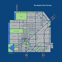
The Reemergence of the Islands of SF
Being a grumpy old man, I am not on the Face-book, but it seems that my “Islands of San Francisco” neighborhood map is being “liked” by the kids. Flattering to watch it circulate!
Take this opportunity to obtain a lovely physical copy of this map for a very affordable $20 over on Zazzle.

Look at the detail! And no streets to argue over! I mean, I’d easily lay down some platinum coins for this.

It can be seen on the walls of many a discerning San Franciscan.
http://twitter.com/jasonbentley/status/285974660569518080
For full effect, I recommend getting a version that’s at least two-thirds of your height.
Hey @burritojustice. Look what I got today. http://t.co/gGp3EPWI—
Sara Mauskopf (@sm) January 12, 2013
If you WANT to pay more money, I can help. A reader bugged me to make a version available on Zazzle’s wrapped canvas option. I had never considered this, but turned out to be pretty damn awesome.


It’s not cheap, but neither is matting and framing. And you also get the satisfaction of imagining that Zazzle accidentally sent you a pizza.

Just keep your eye open for Zazzle discount codes.
I’ve had a couple of requests to reproduce it — if you go to the SFAR building on the corner of Grove & Franklin, you can see a rather giant version in their entryway.


If anyone wants to put this on the side of a building or trace it out in the desert, I’m game — ping me on Twitter!
And let us not forget the inspiration for my map, @optshiftk‘s lovely diagram of Seattle, also available for sale on Zazzle.


Great. I’ll take it in a different colorway. Here’s one of my favorite palette inspirations.
Let me know what you can do. http://pinterest.com/pin/105693922475931275/
I would never want to fuck with your artistic vision, but have you ever considered doing versions in other colors? Like, maybe, varying shades of a single color? I think that would look great! P.S. My dad has The Facebook and he is 70.
Hmm, lemme see what I can come up with. Any colors in particular?
I’d really to to figure out a laser-etched version. That could be sweet.
I just might be the miscreant who cropped your original map from ~2010. I just wanted the various ‘hoods to be legible scaled down to fit my narrow-columned blog. At your request, I just updated the image I was using on my blog to the latest version (which, I might add, is kind of fuzzy compared to the old 800px wide PNG). Anyways, love the map, and frequently refer new-to-SF folks to it.
Ha! No worries, totally understand the width thing. Let me look at the image quality tomorrow and see what I can do. Thanks though, I get a steady stream of traffic from you — you have a great collection of neighborhood maps there.