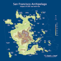
Muni is the Heart of San Francisco
July 28, 2010
Speechless. All hail our new data visualization god Eric Fischer!
Muni movements, June 1st, 2010:
All of June, 2010:
Anyone want to come up with a soundtrack? (Not Air though.)
Fans of Tufte: 14L (red) vs 14 black): Time is the x-axis, stops are the Y. The steeper the slope, the faster the bus.

This was basically Armand’s 24 hours. (His day-long McDonald’s chart would be much less interesting.)
Also see the 1-California and 38-Geary (including inbound and outbound only).
Muni vs BART from Daly City to Downtown would be a fun chart.
4 Comments
leave one →


You’re too kind!
That Muni vs BART one to Daly City would probably be interesting. Thanks for suggesting it.
Another view that might be interesting is to superimpose BART movement in red on the ‘heartbeat’ videos.
Norway by Beach House is my soundtrack suggestion :)