Name Space
March 23, 2010
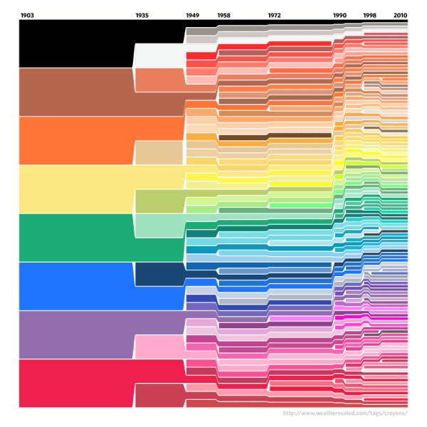
Remember Weather Sealed’s crayola color history?
His data-slicing color ebullience strikes once more, but this time with historical names of humans, based on Social Security Administration data.
The SSA data and the dynamic charts were remarkable in their own right. But WS shows sheer and utter brilliance in how he sorted it:
From the SSA data, we extracted the historically most-often-bestowed first names, one-hundred-and-fifteen per gender, and then charted their relative ratios by year, arranged with the older towards top and bottom and newer in the middle.
Head immediately to Weather Sealed to escape the bounds of my narrow blog to see the data in its full resolution glory.
One Comment
leave one →


that is indeed cool, but the baby Name Wizard has done the same thing for a while now. http://www.babynamewizard.com/voyager
Colors aren’t as dramatic, but dynamic trumps static.