Muni Danger Data
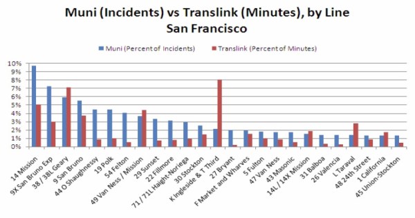
As we await the death of the 26-Valencia, safest bus in the Mission, Nick (loyal SoMa reader, rider of the Mission-traversing 12-Folsom/Pacific and Buboblogger) asks exactly what an “incident” is on Muni.
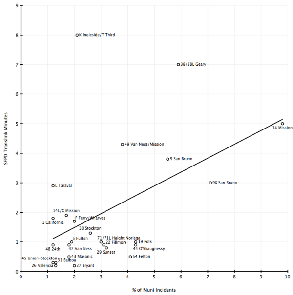
UPDATE: Per secretivek’s request, here’s a quick and dirty conversion to a scatter plot (click to embiggen).
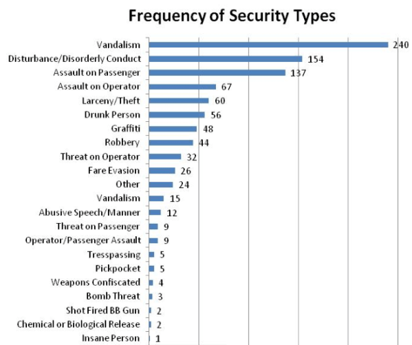
I found the SFPD source document for the bar chart that sheds more light onto incidents. The data below is from January to August (which raises another question, since the minutes were recorded during Sept-Oct — if you KNOW there are 4x the incidents on the 14-Mission, why are you spending twice the time on the K? Then again I’d rather ride the K than the 14.) Here is a breakout by crime:
Assult and disturbance/disorderly conduct is over 37% of incidents. Fare evasion is about 3% of incidents (though I don’t know if this includes fare inspectors). I’m kind of curious on Operator/Passenger assault. Is that the driver attacking someone?
Only one insane person, but I guess that can be enough.
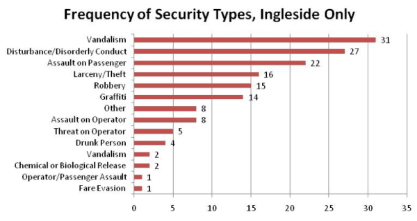
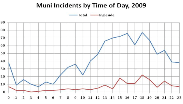
Here are the figures for Ingleside Station that includes the southern Mission, Bernal, Glen Park, Portola, Excelsior and Visitacion Valley.
Here we learn it is significantly safer to ride Muni in the morning:
Muni in morning
BART at night
You will get
Home alright


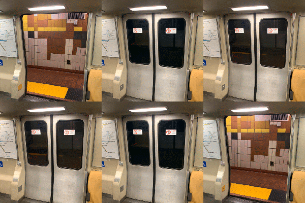
Oh, I like that last part. And howabout
Don’t stab
Your operator
You might not
Be in danger
Could somebody graph the first set of data (incidents vs minutes) on a scatterplot? that would be a lot more useful than the bar graph.
I will if I get a chance, but remember the crime stats are for Jan-Aug and the minutes were recorded during Sept-Oct.
But that actually makes it more odd — if they already knew there 5 times as many incidents on the 14 than the T, why are cops spending twice as many minutes on the safer line?