Sanborn San Francisco Map Lettering
Bibliodyssey recently highlighted the rather amazingly ornate title pages of our favorite historical map source, Sanborn.


San Francisco was sadly lacking, so as a public service I present you our very own Sanborn title pages. Click to enlarge:
1887:

($100 in 1887 is about $3000 today.)
1899:

LookBackMaps made a rather epic skateboard using this design:

(The top and bottom of the crest on the bow and stern of the deck was a touch of genius.)
The 1913 edition is pretty awesome:

California maps can be viewed via SFPL.org if you have a library card & PIN. Also, the SF 1899-1900 set is available on sfgeneology.com.
The originals are in color — the University of Utah has done an outstanding job on their collection. (Some of the trials and tribulations of this project are documented here.)
In all reality, the entire set needs to be rescanned — the ProQuest scanning is pretty dodgy quality, especially for the oldest maps. (I believe they used from the microfilm versions.)
Hey, can someone just buy Sanborn for me so I can tile all these together into a map layer? (Hint hint, Google).


I love these! So much so I once used Zazzle to make stickers and a skateboard out the 1899 ones: Here’s the skate.
HOLY CRAP THAT IS AWESOME.
Hey, how was the history expo at the Mint? (Just couldn’t get over there this weekend, sorry.)
Great expo at the Old Mint! Amazing how many amateur history enthusiasts there are in SF. But we were lamenting the lack of a Mission organization…may have to do something about that soon.
“…if you have a library card & PIN.”
Wait, there are people who don’t have library cards??? :-P
I agree, the 1913 one is sweet, almost like a movie poster…
History expo was geekolicious. Really great.
Excellent typographic spectacular here, sir.
What I learned at the history expo: there are a lot of us nerds in SF :D
I would KILL for a t-shirt with that last design on it.
K I L L.
Hide your kids, hide your wife. tk’s killing everybody out here.
This is what happens when typography meets fashion, people. Tragic.
heh. whoa… you should be able to just bite the design and throw it up on zazzle and you can work that into any hue of american apparel in a matter of minutes. If not, let me know, I’m sure i’ve got the png laying around somewhere…
oh, didn’t even notice that’s a nice fat jpg already up here for 1899. you just might want to clean up the marks in the white spaces around the edges…
Oh yes, we are working on that, fret not. :)
I was toying around with colored highlights on the sunburst and letters, but a) taking a while and b) too much?
yeah, got to keep to the original, i’d say, except where you can clean up some of the scanning blemishes. These make nice stickers too…
Johnny, if you’re working on a t-shirt, do let me know when it be done:
40goingon28@gmail.com
No color. Straight B&W.
Underway. It’s looking pretty damn good.
The thin lines and fill are a bitch to crop so I don’t think this will look good on non-white t-shirts (though yellow and light blue might be OK). Definitely no dark colors.
(Sadly I don’t have enough sample letters to make a Burrito Justice version.)
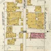
the craft of those pen drawings is impressive. I posted a few Arkansas Sanborn maps on my blog:
Thanks drew — the hatchwork and engraving is amazing.
I just realized that the first example is CRIPPLE CREEK. I’m thinking we need a new micromicro SF hood inspired by this place… Non ?
Cripple Creek and Butchertown would be immediate enemies.
When Gulchie the Sinkhole reemerges, we can rename the area CC.
We adore Sanborn maps at SFgenealogy. Thanks for mentioning that we have them online!
Thanks — I use them all the time! Where did you get the archive from? The scans of the title pages are much better than the version available on ProQuest.
I’d love to get scans of the original color versions online some day.
I don’t remember exactly where we got them. I would have to look it up. :)
As for the color ones, for which years? As you may know, they were manually updated by just pasting the new info directly onto the pages. The SFPL History Center has a nice set that might be photographable. I don’t know of any other local original sets out there. Maybe Bancroft, Stanford or SF State might have some?
Um, all of them? :)
Do you know which years SFPL has? We need to hook them up with David Rumsey.
johnny0,
Did you ever make those t-shirt designs available?
Drop me a line directly if you might.
-Ron