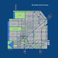
Day in the Life
Quick, what’s this?

Pollock?

An aorta? Or a Picasso? There’s gotta be an eye and an ear in there somewhere…

Perhaps a wiggly Mondrian? Or the lower GI tract from the Transit for Body map?
Alas, no. It’s a day in the life of Muni, according to NextBus. 1) Downtown, 2) Mt. Davidson and 3) the Mission respectively.
Plotted from NextBus data by the ever awesome Eric Fischer.

Eric informs us that the data is from about noon today (the 14th) to noon yesterday (the 13th).
Black < 7 mph
Red < 19 mph
Blue < 43 mph
Green > 43 mph
Given thick blue line through the tunnel, it includes light rail. Given their ‘speed’, the J, L and N don’t even register beyond 19 mph.
But there is too much red and black, too much below 8.1 mph.
Give me more blue! I want more dedicated right of way and pre-paid boarding. Or I will demand many tunnelling machines!


I guess I should write better captions, but you could ask instead of guessing!
Black is less than 7mph. Red is less than 19mph. Blue is less than 43mph. Green is above that. The day is the 24 hours just before I posted it.
I like that shot o’ the Irish green through the deadly east-west mid-town Oak/Fell luge.
One day I followed the street cleaning trucks as they swept Oak street mid day. They never dropped below 30 MPH.
The dust cloud eventually lifted, revealing absolutely no change in the actual litter count curbside.
Not bike friendly, for sure.
‘Speed’ would have been a short subject film, had it been set in SF. And that would have been an improvement.
Hey, come on, most drivers are more personable than Keanu.
muni sucks, wats new?
These are so cool. If you ever make them poster size I’ll totes buy one.
Naw, Muni doesn’t suck. Muni’s the ugly girl in junior high who’s gonna be totally hot by senior year.
C’mon Muni! Drop the weight and get some better clothes! Sleeping around a bit wouldn’t hurt either.
Beautiful diagrams, but 7-19 mph is a huge range! For local-stop transit in most of North America, 19 mph would be pretty fast. You’d have a more confronting and motivating map if you set black to be, say <10 mph.
Not sure why there's green on all the freeways, most of which have little or no bus service apart from 101 and the GGB approaches.
Yes, I should have thought about the colors a little more. When I wrote the original program to do the plotting, I intended the colors to correspond to walking, bicyling, motor vehicles on regular streets, and freeways/BART, so they don’t apply so well here.
Here is another version with new color ranges to correspond to what seem to be the typical ranges of operating speeds, with divisions at 3.5, 5.5, 10, and 22 mph.
Muni’s own maps use 5, 7.5, 10, and 12.5 mph as the speed divisions, by the way.
I don’t know what all the movements recorded on the freeways are. Maybe they are out-of-service buses being moved between maintenance yards?